In the digital age, it’s not enough for a restaurant to just have a website.
Sure, recent studies have shown that 77 percent of consumers check out local restaurants online before paying them a visit or placing a takeout or delivery order.
But there’s more to that statistic—nearly 70 percent of consumers also said that if they have a bad experience on a restaurant website, they’ll find somewhere else to eat.
If your website isn’t engaging, user-friendly, and mobile-optimized, you could be literally driving guests toward your competition. Here’s what you need to know to create the best restaurant website you can—and the one tool you need to do it.
What Do the Best Restaurant Websites Include?
When it comes to the information and features you can include on your website, your list of options is as big as your website design ability (and budget). Some things are pretty essential for a great restaurant website, though, including:
- Basic information, like your restaurant’s location, the kind of food you serve, your operating hours, and your contact information. All of this should be easily accessible from the homepage at all times (including it in a footer works really well).
- A menu, since that’s what many guests are looking for when they land on your restaurant’s website.
- Online ordering information, whether you offer delivery, or just takeout for guests to pick up.
- Marketing tools. This can include a blog, an events calendar, an email list signup, gift cards for sale online, links to your restaurant’s social media channels, and more. Your website is a great way to advertise your restaurant, so take advantage of the opportunity to use a variety of unique marketing tools that will help sell your restaurant to visitors.
- Search engine optimization (or SEO), which uses the wording, design, and technology of your website to make sure it ranks high in Google searches for restaurants in your area, the type of cuisine you serve, a certain dish, and more.
With those must-haves in mind, let’s take a look at some real-life restaurants with great websites that nail those features. Read on for the design inspiration you need to take your own restaurant website to the next level.
Basic Information and Restaurant Contact

Scottsdale, Arizona’s The Hot Chick has a great info section. It’s in their website’s footer, which means that from the homepage or any other page of the website, guests can access this vital information just by scrolling down. The footer is pretty minimalist, which makes it easy to see the restaurant’s contact information at a glance.
It includes The Hot Chick’s address and phone number, as well as links to its Instagram, Facebook, Twitter, and YouTube pages. There’s also a link to an accessibility assistance page to assist guests with disabilities.
An Interactive, Engaging Menu

Too many restaurants upload a PDF menu to their websites and call it a day. But that creates a terrible experience for guests—PDF text is way too small to read on a smartphone, which is what the majority of people use to search for restaurants, requiring guests to pinch and zoom all over the screen to get a sense of what your restaurant offers.
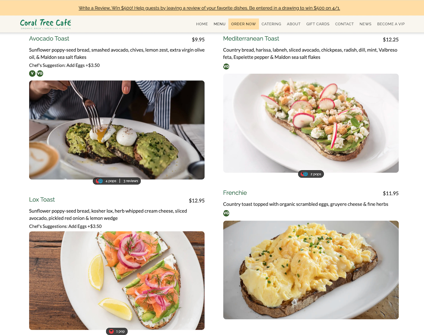
Brentwood, California’s Coral Tree Cafe does something totally different—and totally effective. Their online menu is mobile-optimized, meaning it automatically resizes depending on the size of the screen a guest is using to view it. It has a simple design full of gorgeous dish photos that show guests exactly what they’ll receive when they order. Vegan and gluten-free dishes are clearly marked, and descriptions provide guests with ingredient information, for those with food allergies.
But what really sets Coral Tree Cafe’s online menu apart is that it’s interactive. Guests can leave hearts on dishes they love, and leave reviews for individual dishes, too. This turns the menu into not just a tool, but an experience for guests.

Easy, Accessible Online Ordering

Online ordering is a convenient way for guests to enjoy your food, and it can make your restaurant more accessible to guests who aren't interested in visting in person.
Washington, D.C.-area’s Taqueria Habanero has a great website strategy for this. A link to place an online order is front and center on their colorful, well-designed website. Guests just need to choose the location that’s closer to them, and they’re taken straight to an online ordering page where they can choose whether they want to pick their order up or have it delivered.
Marketing Tools to Engage More Guests

Your restaurant’s website should have the primary goal of conveying important information to your current and potential guests. But since you have the website anyway, you should absolutely embrace its potential for marketing your restaurant.
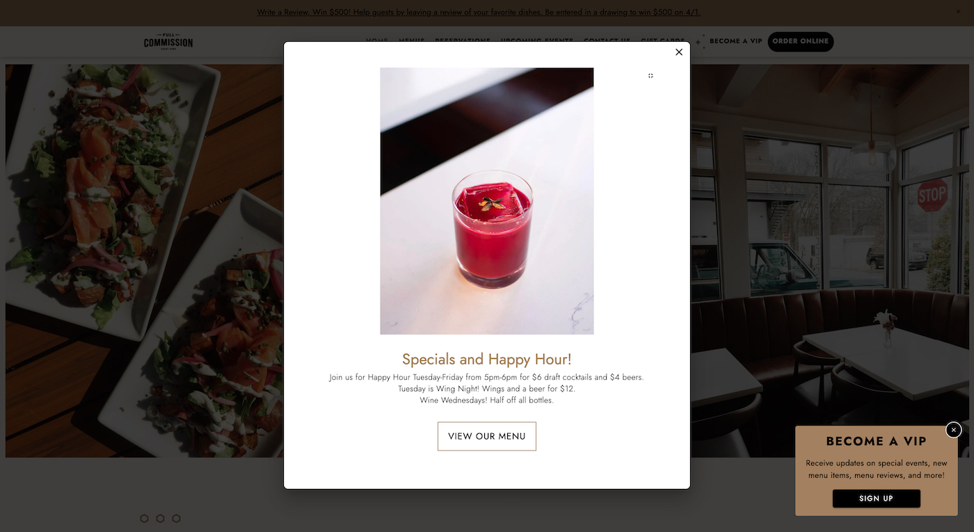
That’s what the team at Atlanta, Georgia’s Full Commission has done. As soon as you land on their restaurant’s website, you receive a pop-up display that advertises their current specials and happy hour. If those sound appetizing, there’s a link right there in the pop-up box to help guests navigate to their online menu. At that point, once they see the mouth-watering photos of dishes available at Full Commission, we bet they won’t be able to resist planning a visit or placing an order. This is a great use of the menu as a marketing tool.
Search Engine Optimization
What use is a great website if no one can find it? SEO ensures that your restaurant’s website shows up at the top of the search results for any relevant searches, from “restaurants near me” to a special dish you have on your menu.
SEO can be hard for restaurants to master, especially because it’s a constantly moving target as Google updates its algorithms and search best practices. That’s why most restaurants could benefit from having a tool to make sure their SEO is on point—like Popmenu.
Beautiful, User-Friendly Website Design
We saved the best for last. One of the most important factors (and what sets the best restaurant websites apart from their competition) is simple: Web design.
Restaurant website design needs a few things that might be different from web design for other types of small businesses:
- High-quality images, so your menu items can be front and center (and make guests’ mouths water when they visit your site and see all that delicious food).
- Bright colors and typography that match your restaurant’s real-life branding—your website should be an extension of the dining experience guests will have at your restaurant, so try to mirror the tone and vibe of your physical presence.
- White space so your site looks high-end and sleek—not cluttered.
- Headers and navigation bars that make your website easy to navigate, even for guests who are visiting it for the first time.
- A template that’s designed with the user experience in mind. After all, your website is a tool to benefit your guests.
It doesn’t matter what kind of cuisine you serve—from Mexican to Italian to ice cream to food truck grub and everything in between. The best restaurant websites follow these best practices, and you can, too.
Popmenu: The Easiest and Most Affordable Way to Make the Best Restaurant Website
As it turns out, Popmenu is the key to creating a restaurant website that has all these features and more. In fact, every restaurant website on this list is powered by Popmenu.
Popmenu is the all-in-one digital toolkit that helps modern restaurants succeed online. It can help you:
- Build and manage an incredible website;
- Create an interactive, user-friendly, and mobile-optimized online menu;
- Automatically remarket to guests, turning first-timers into regulars;
- Offer direct online ordering for pickup or delivery;
- Boost your restaurant website SEO so you always top the Google results list.
In other words, Popmenu is so much more than the best website builder for restaurants—it does everything a modern restaurant needs to stand out in the digital age. Many restaurants turn to sites like Wix or Wordpress, but there’s a big problem: Those website builders are made for ecommerce businesses, not restaurants.
Popmenu was designed to address real issues voiced by real restaurant owners. It’s the only digital platform of its kind that’s made just for restaurants, and with their budgets and bottom lines.
And here’s what makes Popmenu even better: You can get all those digital tools for one low monthly price that never goes up. Popmenu is easy, convenient, and affordable—and will help bring more guests to your tables.
Popmenu Indie: Start Your Free Trial Today
It’s time for building a restaurant website to be easier, faster, and more affordable. That’s why we built Indie, and why we’re sure you’ll love it.
Ready to see for yourself? Your first two weeks are risk-free, giving you a chance to see how you can bring your restaurant and hospitality experience to life online. See if Indie is the right fit for you!


