They say you can learn everything you need to about a person, place, or experience from your first impression. When guests choose your restaurant, your menu is often one of the first things they see.
Your menu is what introduces guests to one of the most important parts of their dining experience: your food. And while the menu may not be their very first impression when they walk in the door, odds are they took a peek before they even decided to dine at your restaurant—recent studies show that 89 percent of diners research restaurants online before they visit them, which makes your menu truly one of the first places guests will get to know your restaurant.
That's why it's so important to have a well-designed menu—but also a menu that translates seamlessly to an online experience that gives guests that great first impression that brings them through your door. If you're looking for menu design tips and inspiration, look no further—read on for some of the best restaurant menu ideas we've seen, as well as the tips and tricks that make them so effective.
8 of the Best Physical Menu Designs You Can Learn From
We know online menus are often a guest's first impression of your restaurant, and we'll get to those further down. But first things first: Physical menus.
There are very different strategies restaurateurs should use for physical menus versus digital ones. Physical menus may not be your guests' first impression, but they're a vital tool for communicating with your guests, setting the tone for their visit to your restaurant, and, most importantly, selling your dishes.
Your physical menu can be loaded with menu engineering tricks to help encourage guests to focus on high-profit items, add appetizers or drinks, and other strategies to help increase check sizes across the board. The restaurants below all use their menu design as a part of the overall experience they offer to guests—and as clever marketing tools to encourage guests to eat and spend more.
Boise Fry Company
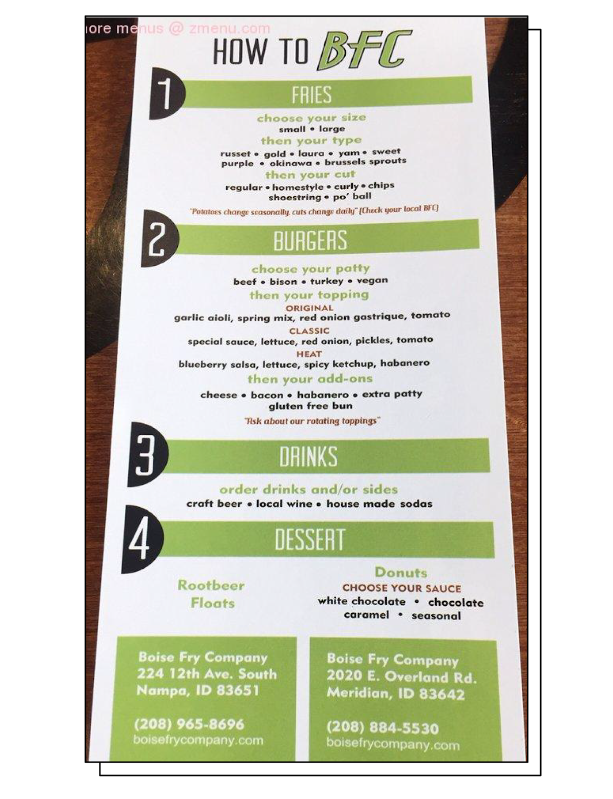
Boise, Idaho's Boise Fry Company is a fast-casual spot that promises "fries with burgers on the side." It's exactly what you'd expect in Idaho—the state famous for its potatoes—as the menu makes it clear that spuds are the stars of the show.
Boise Fry Company's menu is designed as a step-by-step ordering process: First you pick your size, type, and cut of fries; then your burger and toppings; and in steps 3 and 4, you add a drink and a dessert.
What makes it the best restaurant menu design?
Boise Fry Co.'s step-by-step menu design subtly encourages guests to order more than just the fries and burger they likely came for. When guests are given a list of 4 steps to follow, it subconsciously doesn't make sense to stop at Step 2, which means more guests likely purchase drinks and desserts, even if they weren't planning to or otherwise wouldn't add those items to their order. It's a simple trick that likely increases many check sizes.
Bub City
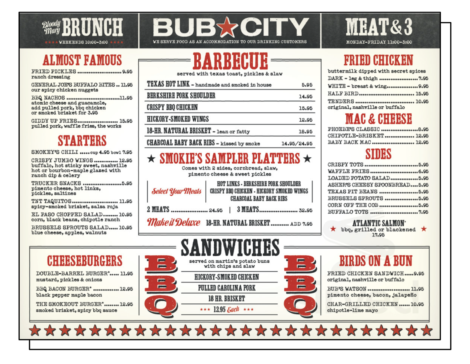
Bub City, a barbecue chain with locations in Chicago and a handful of other cities, offers everything you'd expect from a Texan BBQ joint: Large servings of a wide variety of smoked and grilled meats, sides like fried pickles, potato salad, and corn, plus fried chicken, sandwiches, and burgers.
Bub City's menu is definitely part of the overall experience guests have when they visit; it seamlessly matches the restaurant's theme—and its unique branding—with red stars, bold typography, and gunmetal gray color scheme that evoke smoke and BBQ.
What makes it the best restaurant menu design?
Bub City's menu design perfectly fits the restaurant's brand identity—it's impossible to look at that menu and think of anything but big, bold, barbecue flavors. More than that, the menu is designed with a highlighted center box that draws the eye with its color and bolder, darker typeface. It's where Bub City lists its meats and sample platters—all the highest-ticket items on the menu. Things like appetizers, sides, and even burgers and sandwiches are in smaller fonts around the menu's border, letting the smoked and grilled meats take center stage.
Panka
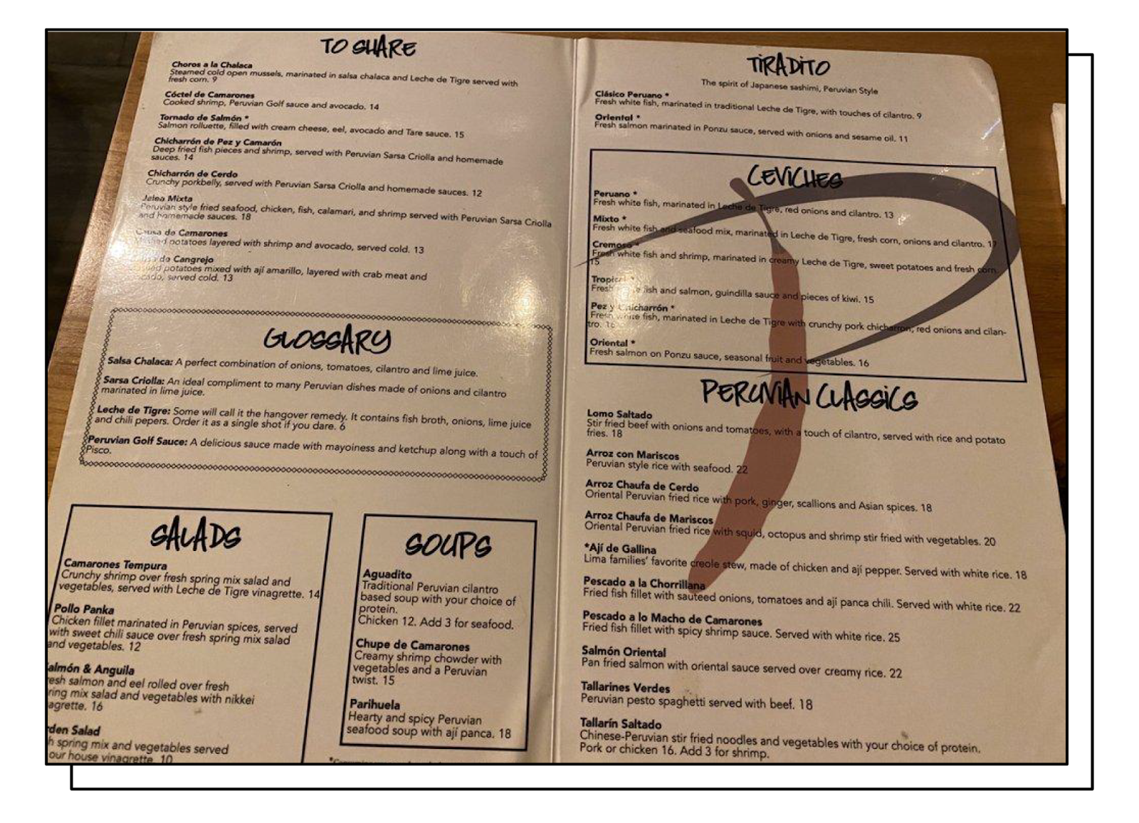
Des Moines, Iowa's Panka serves authentic Peruvian cuisine—not something many guests are accustomed to seeing in the heart of the midwest.
At a glance, Panka's menu looks pretty typical, divided into sections for sharable plates, salads, soups, and entrees. But a closer look reveals a clever design trick that likely boosts check sizes at Panka.
What makes it the best restaurant menu design?
On the left panel of the menu, Panka includes a glossary of some common Peruvian sauces and flavors. In a community where Peruvian food might not be very familiar to many diners, this is a great trick to help guests better understand the menu and order unfamiliar foods with confidence. The glossary uses familiar terms and descriptive language to make guests' mouths water, likely also inspiring them to seek out menu items that contain some of those crave-worthy flavors.
Honey Well

West Harlem's Honey Well is a hidden gem in New York City, with a simple menu of homey, southern-inspired dishes.
Honey Well's creative menu is honey-colored, of course, and divides its bite-sized list of offerings into appetizers, sliders, and desserts, with a small special section for "balls on balls on balls," otherwise known as Honey Well's signature meatballs.
What makes it the best restaurant menu design?
With one glance, Honey Well's menu just feels inviting, in the same way that southern-style cuisine should. It feels like the kind of food you'd find on the family table for a Sunday lunch.
But Honey Well takes this branding a step further with how some of the menu's descriptions are written—take, for example, the Chex Mix, which is described simply as "Homemade by Momma, ask her." We don't need to ask her, because when a dish is "homemade" (not housemade, homemade) by Momma, you already know it's going to be perfect. Honey Well is leaning into an often overlooked part of menu design: How food can be used to evoke memory and emotion. Anyone craving their mom's cooking will find it hard to resist that Chex Mix, which is likely a high-margin item for Honey Well.
Kachka

Portland, Oregon's Kachka takes pride in bringing authentic Russian cuisine to the Pacific Northwest. With both hot and cold bites, dumplings, pickles, and lesser-seen offerings like stewed rabbit and "herring under a fur coat," Kachka isn't shying away from everything that makes Russian food delicious, despite a largely American audience that may not be familiar with the dishes.
The largest and most prominent sections of Kachka's menu are for cold and hot "zakuski," which are smaller, shareable plates similar to tapas.
What makes it the best restaurant menu design?
At the very beginning of its menu, Kachka offers a few steps to help guests learn "how to eat like a Russian." Some steps include, "cover every square inch of your table with zakuski," "fill everyone's glass with their beverage of choice," and "clink. drink. eat. repeat."
These instructions evoke the family-style ambiance of a restaurant like Kachka, where guests are encouraged to order and share many small plates, trying a wide variety of Russian flavors in the process. The subtly challenging nature of learning "how to eat like a Russian" likely encourages many guests to order a table full of zakuski instead of a single entree, leading to bigger check sizes.
Jules
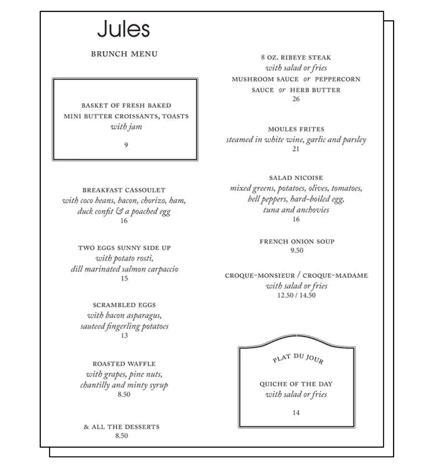
Vancouver, British Columbia's Jules Bistro offers a simple Brunch menu of French-inspired dishes.
Jules has a very minimalist, beautiful menu that reflects the simplicity of the food. It's pared-down, allowing the dishes and their simple, seasonal ingredients to speak for themselves.
What makes it the best restaurant menu design?
Jules also uses a clever trick to encourage more guests to order certain dishes. At the top left and bottom right of the menu page are two items that are surrounded by decorative borders, meaning they immediately act as magnets for a guest's eyes as they scan the page.
The first highlighted dish is a basket of fresh-baked croissants and toast with jam. This is likely a dish that is very low-cost for Jules, which means at $9, it's likely to be a high-margin item for the restaurant.
The other dish with a border around it is the quiche of the day. Since a quiche can come in just about any flavor you can dream up, a quiche of the day is a great way for Jules to use leftover ingredients from other dishes, reducing waste and keeping food costs low. By drawing guests' eyes to the daily quiche special, Jules is subtly encouraging them to order this dish that, aside from likely being delicious, helps the restaurant save on costs.
New Hope Mills
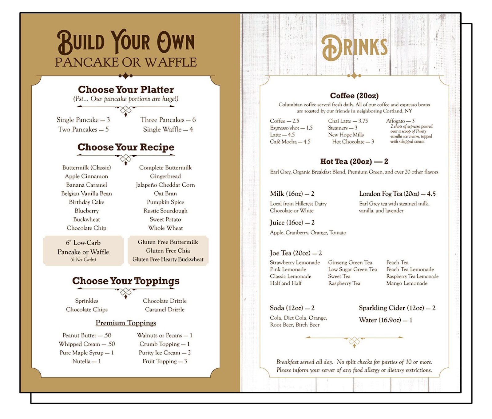
Auburn, New York's New Hope Mills is known well outside its hometown for its packaged pancake and waffle mix. So it's no surprise that the New Hope Mills store includes a cafe where guests can create the pancake or waffle platter of their dreams.
The New Hope Mills menu is simple, with just two panels: Pancakes and waffles on the left, and drinks on the right.
What makes it the best restaurant menu design?
The simple, two-page design of the New Hope Mills cafe menu makes ordering feel like a simple, two-step process: First you design your pancake or waffle platter, choosing multiple cakes and adding premium toppings, of course. And then you choose the drink that will accompany your meal.
New Hope Mills is using a few smart strategies here: First, the two-step menu layout makes guests feel like ordering a drink is just part of the process. Where normally a guest might have just gotten food and skipped the coffee or tea, the menu encourages ordering a beverage.
Second, New Hope Mills lists the premium pancake and waffle toppings alongside their prices, but only displays the prices as numbers, not as dollar signs. This is a classic psychological trick used in menu engineering—when the dollar sign isn't displayed alongside the price, guests are more likely to splurge on more expensive dishes (or, in this case, add-ons).
Fish Nor Fowl

Pittsburgh's Fish Nor Fowl is a new American steakhouse and restaurant offering simple dishes that let sustainably sourced ingredients sing.
Fish Nor Fowl's menu is simple. It reflects the upscale environment of the restaurant through its straightforward lists of small and large plates, presented in elegant lettering.
What makes it the best menu design?
Fish Nor Fowl is taking full advantage of something many restaurants shy away from when designing their menus: White space. It's a well-known graphic design principle that you don't need to fill every square inch of a project—especially a menu—with color or text. In fact, white space helps draw guests' eyes to the text that is there, keeping them focused on the most important thing: the food.
3 of the Best Online Restaurant Menu Designs in the Industry
One of the hardest things for restaurants in the digital age is that best practices for online, digital versions of their menus are often the exact opposite of the best practices for physical food menus.
While in-person menus should embrace white space, digital menus tend to be more successful when they include photos of as many dishes as possible. A digital menu also needs to be mobile optimized so guests can read it on the go—without having to pinch their screen to zoom in on the tiny text on a PDF.
Since online menus are often a guest's first impression of a restaurant, it's absolutely vital to put as much time, effort, and strategy into them as you do your physical menu. The three restaurants below have turned their digital menus into interactive experiences for their guests, and it's paid off for them in important ways.
Winking Lizard Tavern
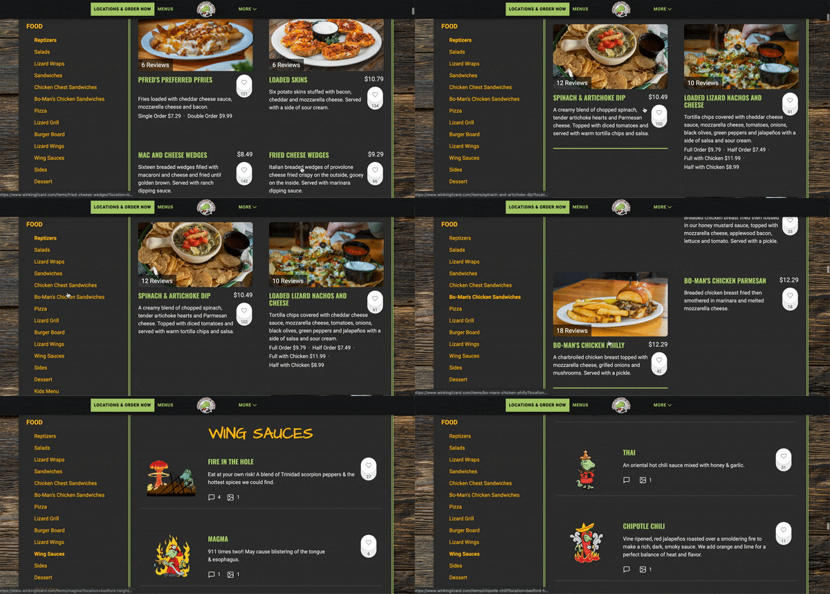
Ohio-based restaurant group Winking Lizard has 17 family-friendly taverns that have built a reputation for being the place to grab a bite and brew and watch the day's biggest game.
At a glance, the digital pub menus for Winking Lizard locations might not look like anything out of the ordinary, but they have a secret weapon: SEO.
What makes it the best restaurant menu design?
SEO (which stands for search engine optimization) is how people find things online. When websites are search engine optimized, they're the first results when someone searches for something like, say, "burgers near me."
Many restaurant websites are not optimized, and even fewer menus are. Since it's so common for restaurants to upload a PDF version of their physical menu to serve as the online version, they can't optimize their menus—Google can't read or index information on a PDF.
Winking Lizard applied SEO best practices to its menus, and has since seen a nearly 100 percent increase in traffic to its home page. In the digital age, this is an essential tactic for restaurants.
Ocean Deli Pizza
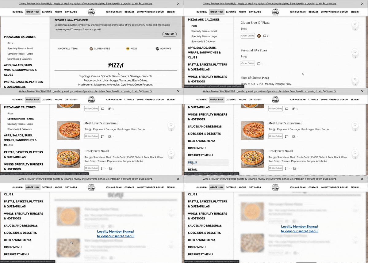
Wallop Island, Virginia's Ocean Deli Pizza is a family-owned business that started as a convenience store and sandwich shop, and grew into a beloved community staple.
Ocean Deli's online menu is easy to navigate, separated into sections for different kinds of food and drinks with a navigation menu on the left side. What sets it apart from other online menus is that each and every item can be ordered directly from the pizza menu.
What makes it the best restaurant menu design?
Restaurants can't underestimate the importance of direct online ordering. Online ordering and delivery have been on a rapid rise in popularity for years, with a sharp increase since the onset of the COVID-19 pandemic. Ocean Deli Pizza's decision to make direct online ordering so easy for their guests has paid off—the restaurant saw its weekly online ordering revenue more than double after it launched this digital menu.
Urth Caffé
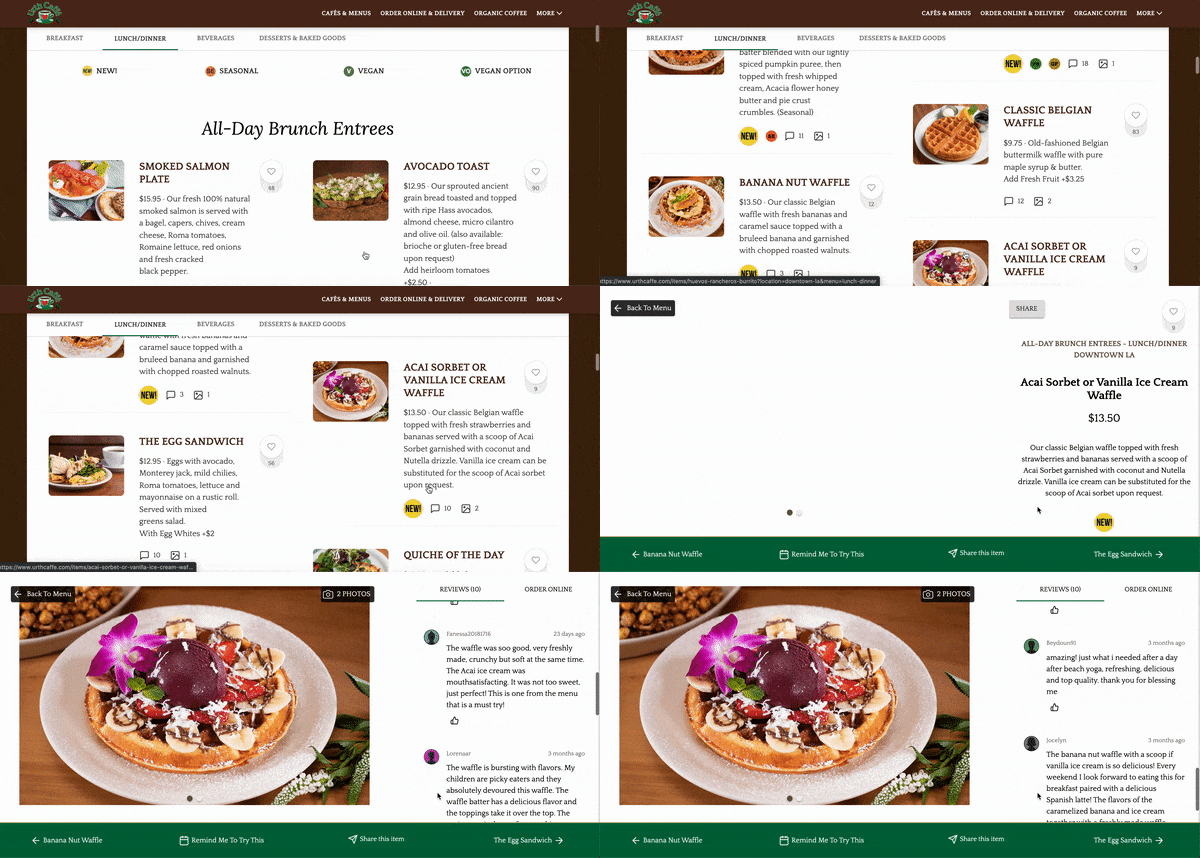
Urth Caffé is an LA-based chain with cafés located across the globe. Since 1989, these cafés have been serving hand-selected teas and house-roasted coffees, with an emphasis on sustainability and guests' health and wellness.
Urth Caffé was one of the first restaurants to embrace Popmenu's patented, interactive menu technology, and its many cafés saw the benefits almost immediately.
What makes it the best restaurant menu design?
Popmenu turns digital menus into interactive experiences for guests who visit your website. The goal is to make digital menus easy to read, but also use them to their full potential as marketing tools, and part of your guests' overall experience with your restaurant.
When Urth Caffé instituted dynamic menu technology, the average time visitors spent on their website shot up to 2 minutes and 57 seconds—nine times higher than the average amount of time guests spend on an ordinary restaurant's website.
Turn Your Menu Into the Perfect Digital First Impression with Popmenu
Making the most of your online menu comes with a whole host of new considerations, from SEO to mobile optimization to ordering integration and interactive design.
Luckily, Popmenu makes it easy for modern restaurants to make the most of their online menus—and the rest of their digital presence.
Popmenu provides restaurants with patented, one-of-a-kind menu technology that turns their online menu into an interactive experience for guests. Plus, there's the Popmenu Print Center, where restaurateurs can use professional restaurant menu templates to turn their online menus into effective physical ones, too.
But Popmenu offers so much more than just menus. It's an all-in-one toolkit that includes website design, waitlisting, automated marketing, social media integration, direct online ordering, and so much more—everything today's best restaurants need to own their entire digital presence.
Start with a modern menu, and end with the digital toolkit modern restaurants need to succeed. Sign up for your free Popmenu demo today.


