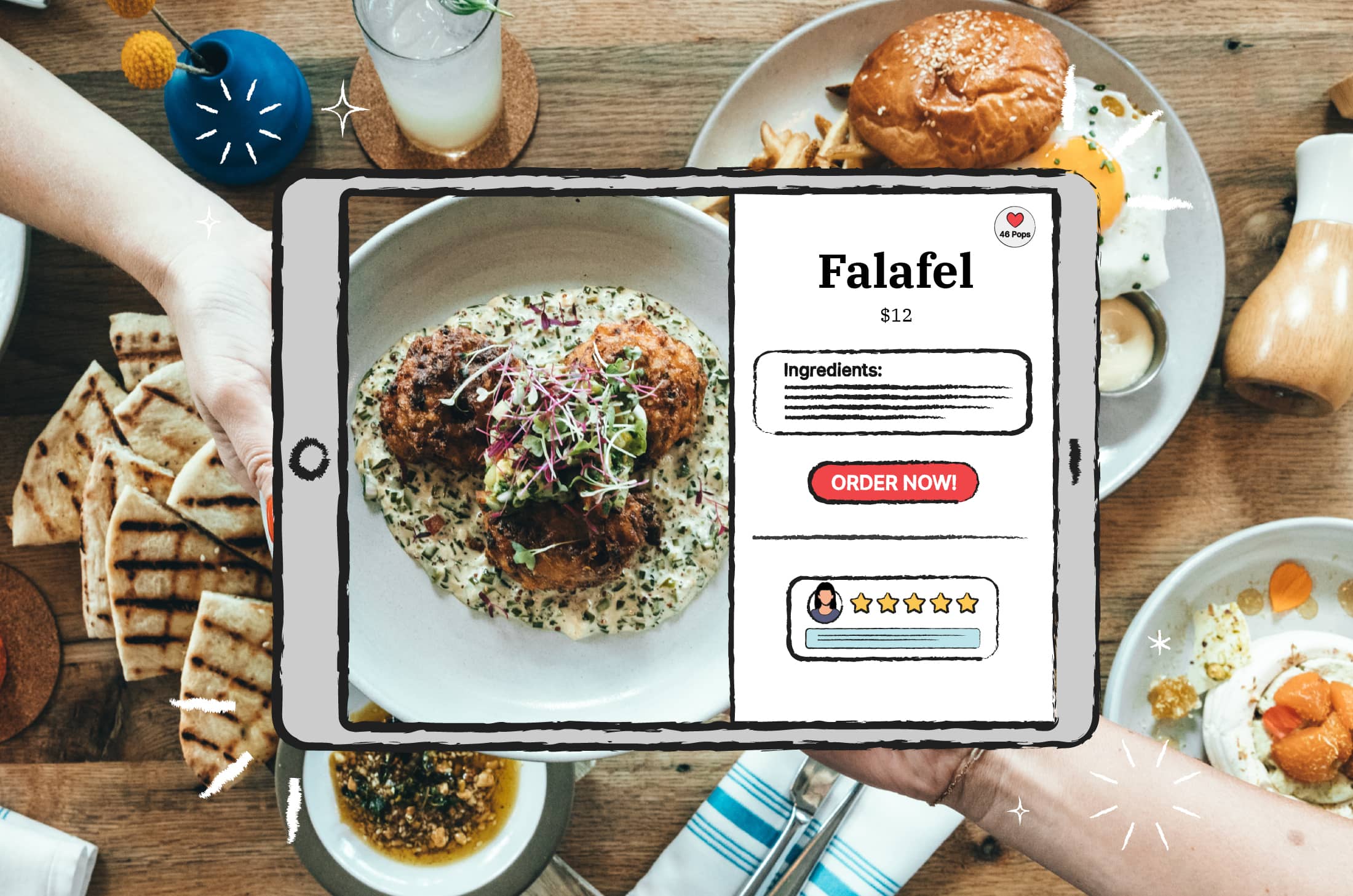
They say restaurant guests eat with their eyes first—but before they get a single glimpse of their chosen dish, they see your restaurant's menu. Your menu is a tool for guests to choose their meals, sure—but it's also how your restaurant makes a good first impression, markets special offerings, and upsells guests on appetizers or desserts they can't resist. Having good menu design ideas can make or break a restaurant's success.
But designing an effective menu is complicated—especially in the digital age. What works for a physical menu may not have the same impact on your restaurant's website. How do you design a menu that will wow guests in your dining room—and then translate to an online version that sells takeout and delivery orders?
If you're on the hunt for menu design ideas for your modern, digital-first restaurant, look no further. These 5 examples are some of the best of the best—and can serve as inspiration for designing an online menu that will wow your guests.
Does Your Restaurant Need a Separate Online Menu?
First things first: Do you really need both a physical menu and an online version?
Be it for online deliveries or contactless ordering, having a digital menu is vital for restaurants today. But why bother with a new menu for online orders when you can just scan and upload your dine-in menu to your website as a PDF?
There are plenty of reasons why dine-in menus in PDF format are a bad idea for online use.
Mobile users constitute 50% of the total internet traffic in the US. Sadly, PDF menus aren’t optimized for mobile screens — which means that guests will have to keep panning and zooming to read the names of various dishes. That's not exactly the first impression you want them to have of your restaurant.
Moreover, PDF files can’t be crawled by search engines. That means you risk missing out on valuable traffic from sources like Google. People searching for your dishes online may not see your restaurant in the search results, costing you potential customers—and revenue.
Finally, PDF menus aren’t interactive. While you can easily hop into a graphic design tool like Canva or Adobe Spark to make your menu look great in a PDF, the end result will be a flat, read-only menu in a digital world where more and more people expect interactive experiences from brand websites.
So, if you’re serious about using your online presence to boost your restaurant’s revenue, a digital menu that’s mobile-ready, search engine optimized, and fully interactive is a must-have. Up next, let’s take a look at some online menu examples from around the web that are worth drawing inspiration from.
5 Online Menu Design Ideas and Examples Worth Checking Out
Designing a menu for in-person dining comes with its own challenges, tips and tricks. Menu engineering can help ensure that your physical menu lives up to its full potential as a marketing tool. But the same tricks that make an in-person menu effective may not translate to the digital world.
Since it’s no longer enough to upload a copy of your physical menu to your restaurant website, you need an online menu that’s fully interactive and optimized for web audiences. Here are a few great examples to use for menu design ideas for your restaurant's website.
Urth Caffé: Interactive Menu Design With Earthy Tones and Serif Fonts
.gif)
Urth Caffé is a global cafeteria chain pioneering sustainable dining with health-conscious organic coffees and hand-selected fine teas along with delicious breakfast items. It’s been around since 1989, with branches open in the United States, Japan, Saudi Arabia, and Dubai.
Urth Caffé partnered with Popmenu in early 2020 to set up dynamic menus and contactless ordering across nine locations in the U.S. The new online menu features earthy tones of green and brown and a rich serif font. Artfully shot photographs accompany each item on the cafe menu.
There are favorite buttons next to each menu item, along with comment sections and options to share dishes on social media. Together, these micro-interactions have boosted user engagement and increased the length of online sessions by nine times the usual average.
Le Mugs: Richly Animated Menu Design With Powerful Imagery
.gif)
Le Mugs is an artsy canteen located at the heart of Saint Raphael, France. Cozy meals in a lively environment are the mantra at this restaurant, with its bold and elegant menu design reflecting exactly that.
Le Mugs uses bright colors, bold typography, and tasteful imagery to highlight each category on its online menu—with interactive animations adding emphasis to the visuals. Each section is properly labeled and you have to click on the visuals to view the contents of a section.
The sections are kept elegant and minimalistic, with concise descriptions and appetizing photographs to highlight each item on the menu. You can use directional arrows to switch between menu sections, allowing for easier navigation.
Fox In The Snow: Artful Typography and Minimalistic Menu Design

Fox In The Snow is a cafe and bakery in Columbus, Ohio. From the very offset, the restaurant gives you an impression of serenity and tradition, with rustic cooking and quaint decor being the star of the show.
The restaurant’s food menu makes use of very few images and relies on artful typography to list menu items in a no-frills fashion. It may not seem as vibrant as Le Mugs, but this restaurant has a simple menu that draws the eye and engages the guest's imagination.
Notice how Fox In The Snow doesn’t use dollar signs next to any of its prices? Studies show that menus that use dollar signs next to prices usually cause buyers to look for cheaper options. Instead, the menu uses bold letters to indicate pricing.
The Original Denver: Bold Typography and Colorful Eye Magnets
.gif)
The Original is a restaurant in Denver, Colorado that serves classic American dishes with a unique, modern twist. The restaurant relies equally on tradition and innovation, with an online ordering menu to match its actual feel.
The restaurant menu is divided into several sections: Lunch & Dinner, Brunch, Happy Hour, etc. Each section is further broken into multiple categories marked by bold titles and thick borders. There aren’t any images, but the restaurant uses a little sketch art to make its menu stand out.
The combination of bold and minimalist design defines the feel of this restaurant. The categories aren’t just put together at random. They’re arranged in specific patterns according to popularity and price. The best dishes are highlighted in bright colors to catch the reader’s eye.
Earls Kitchen: Pastel Colored Online Menu With A Minimalist Feel
.gif)
Earls is a family-owned casual dining chain with a total of 68 restaurants across the US and Canada. The upscale restaurant features globally-inspired dishes to please any taste palate. The restaurant also offers takeout and online delivery through an online menu worth noticing.
At first glance, Earls Kitchen’s online menu looks way too simple. Marked by pastel shades and sans-serif typography, the pages feature only a few images scattered across the menu. If you look closer, however, you’ll begin to see what makes this menu so effective.
It’s the dish titles and descriptions that stand out here. Each dish is appetizingly described using words like “crispy”, “tender”, and “spicy”. The menu descriptions further list the ingredients included in each dish, helping guests easily pick something that fits their taste.
Bad Online Menu Design Can Ruin Your Customer Experience
Ordering online is supposed to be easy. The only way to ensure the best possible experience is to constantly optimize your menu design and avoid common issues, such as:
- If your menu has too many options without proper categorization, it can leave guests feeling indecisive and confused.
- A website that doesn’t offer enough security when making online payments can expose customers to scams and identity theft.
- Sometimes, it’s so difficult to find the menu button on a restaurant website, it causes guests to quit ordering in frustration.
- When it’s unclear how you package and deliver your food, guests will hesitate to place an online order. Knowing the delivery time is especially important for online orders.
Good Menu Design Ideas Can Improve Your Bottom Line
Where bad menu design can cause you to lose potential customers and leave guests unsatisfied, a good online menu can greatly improve your bottom line. Here’s how:
- A good online menu can boost sales and improve return on investment by driving more customers and encouraging them to order more often.
- Online menus are easier to update than traditional PDFs, so you can always tweak menu items and add new dishes on the fly.
- By using analytics tools to track your visitors, you can gather data on guest preferences and find out which dishes perform the best for online orders.
- Online menus even improve your dine-in experience and facilitate safer contactless ordering. Just ask your guests to scan a QR code to view the menu on their devices.

Use Popmenu to Design the Perfect Online Menu
Popmenu is an all-in-one toolkit for modern restaurants in the digital age. From building your restaurant website to managing guest orders to collecting data on customer behavior—Popmenu has everything you need to run a successful restaurant business online.
But one of Popmenu's most popular features is its dynamic online menu builder that makes it easy to turn your restaurant's menu into an interactive experience for guests on your website. From likes to mark their favorite dishes, to individual dish reviews, Popmenu allows guests to interact with your restaurant and its menu—and one another—in never-before-seen ways.
Ready to see how Popmenu can elevate all your menu design ideas? Schedule a free demo today.


