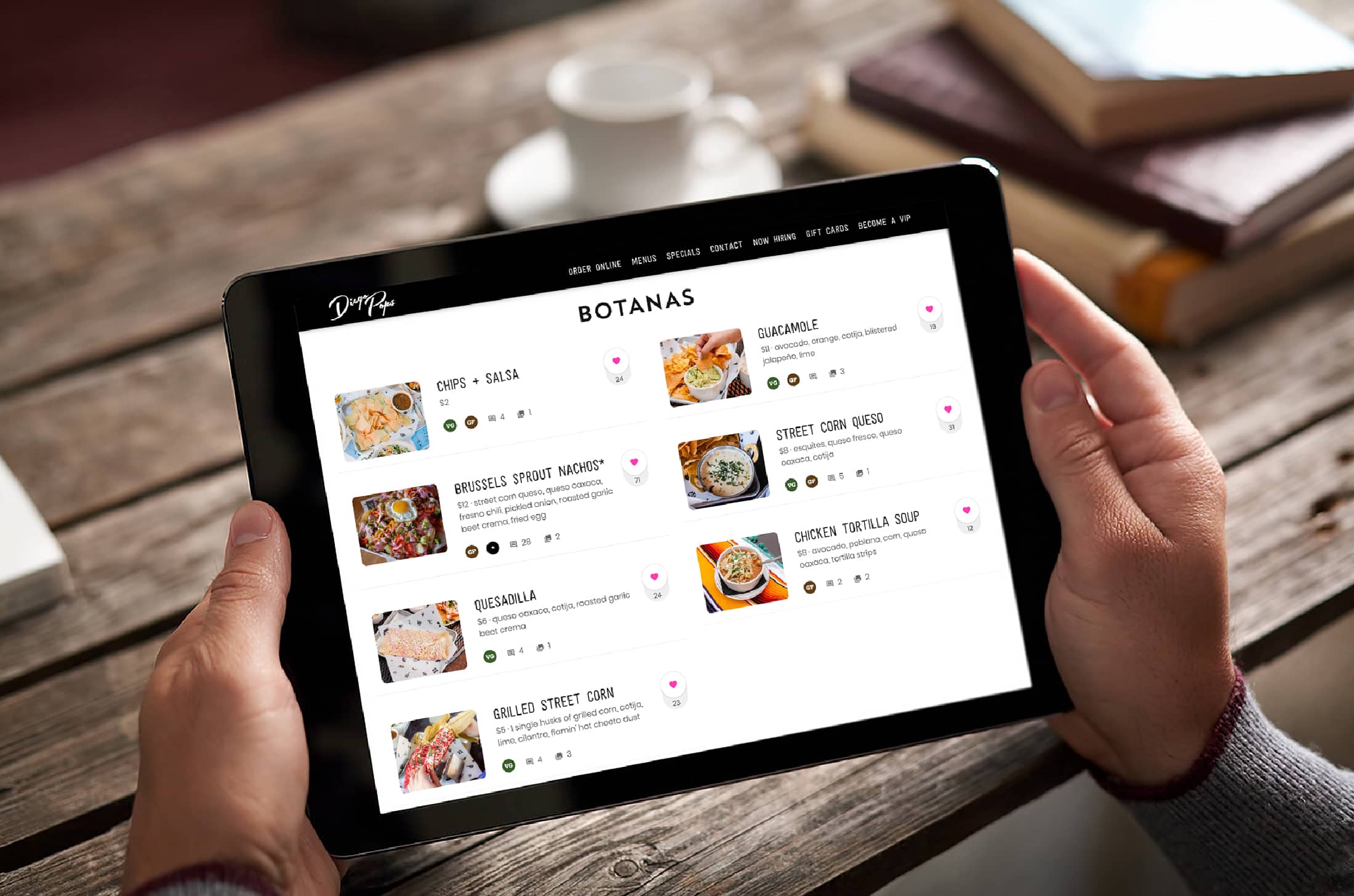
The best restaurateurs know how important their menu can be.
In the best restaurants, a menu is never just a menu—it’s an important tool for communicating with your guests, setting the tone for their visit, and selling them not just the most delicious dishes, but the most profitable ones.
In other words, your menu is an important part of a restaurant business strategy. The right restaurant menu design can have a direct impact on your bottom line—and even make a good restaurant into a great restaurant.
For restaurant owners who are looking for inspiration, you’ve come to the right place. Read on to learn more about the design elements that can elevate your menu, as well as nine examples of great restaurant food menus that can inspire you. From food trucks to fine dining, these are the best examples of how to use your menu to its full potential.
What Makes a Restaurant Menu Great?
There are restaurateurs out there who think a menu just needs to be a list of dishes you offer—nothing more, and nothing less.
The reality, though, is that a menu needs to be much more than that. It should highlight restaurant food options, but also blend design elements and sales techniques that help make it such a powerful tool for converting guests.
Here are 4 factors to consider when designing a great restaurant menu.
Use Design to Highlight Dishes You Want to Sell
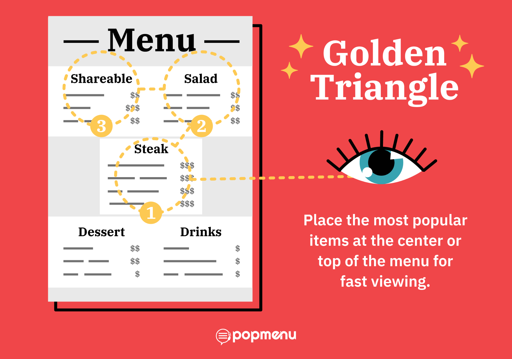
First and foremost, consider your menu’s design. It should look neat and easy to read, and guests should be able to navigate it easily.
But the design can also help you highlight your most profitable menu items. There’s a design trick called the golden triangle that says when people look at a page, their eyes tend to start in the center, then move to the top right, and then the top left in a triangle pattern. That means the items you want to sell more of should be placed at the center or top of your menu, which will ensure that guests see them quickly.
Make a Menu that Matches Your Restaurant’s Branding
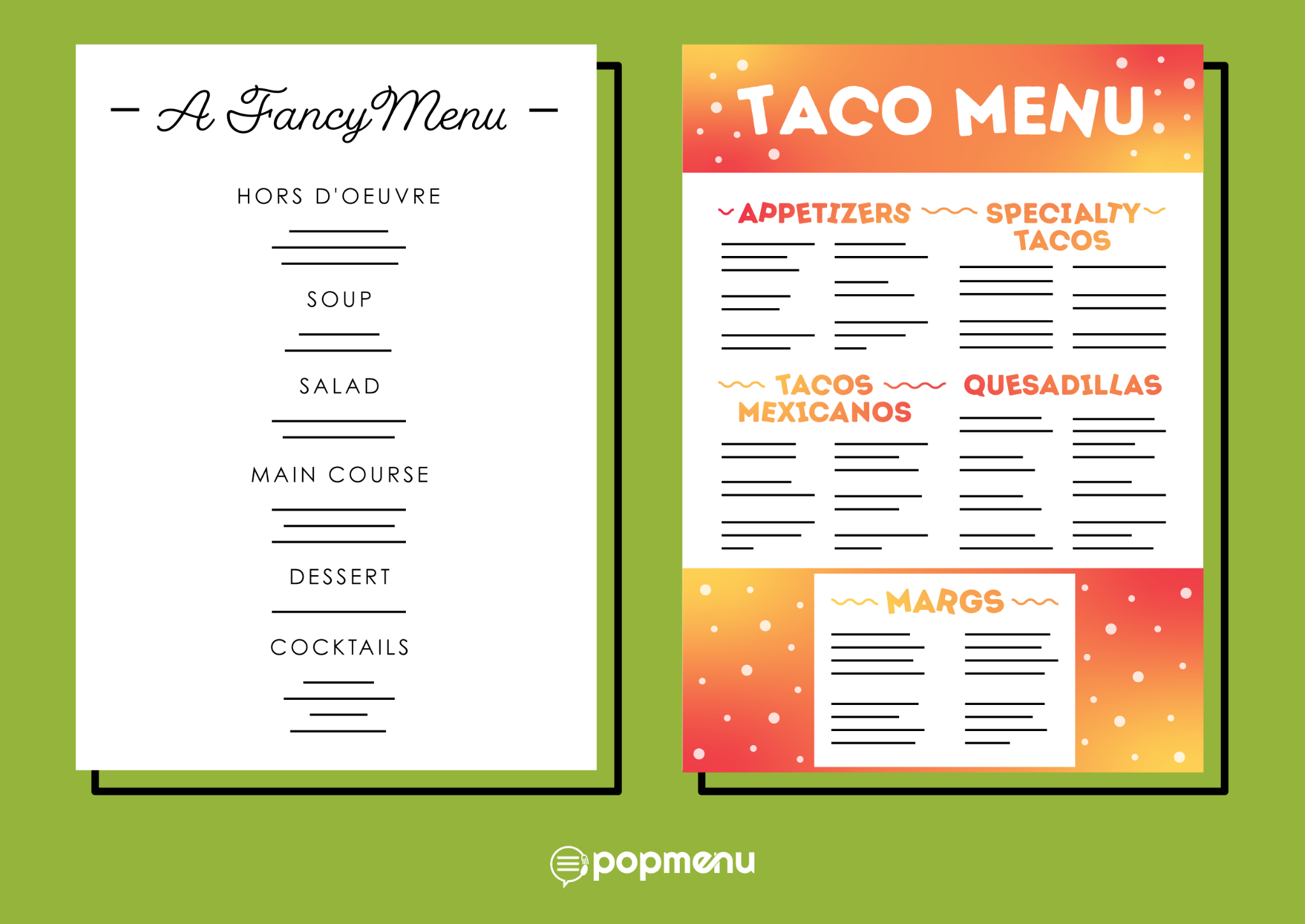
Another important tip to keep in mind while designing your menu is that it needs to fit with the rest of your restaurant’s branding. If you use a certain color scheme or typography on signage, social media, or your website, you should use it on your menu as well. The menu should also reflect your restaurant’s theme and tone, if there is one—for example, the menu for a fine dining spot should look very different from the menu for a casual taco joint.
The idea here is for your restaurant’s branding to be consistent; so, whether a guest is a regular or a first-time visitor, they’ll recognize the branding whenever they see anything—from a website to a road sign to your menu—that represents your restaurant.
Be Mindful About Photos
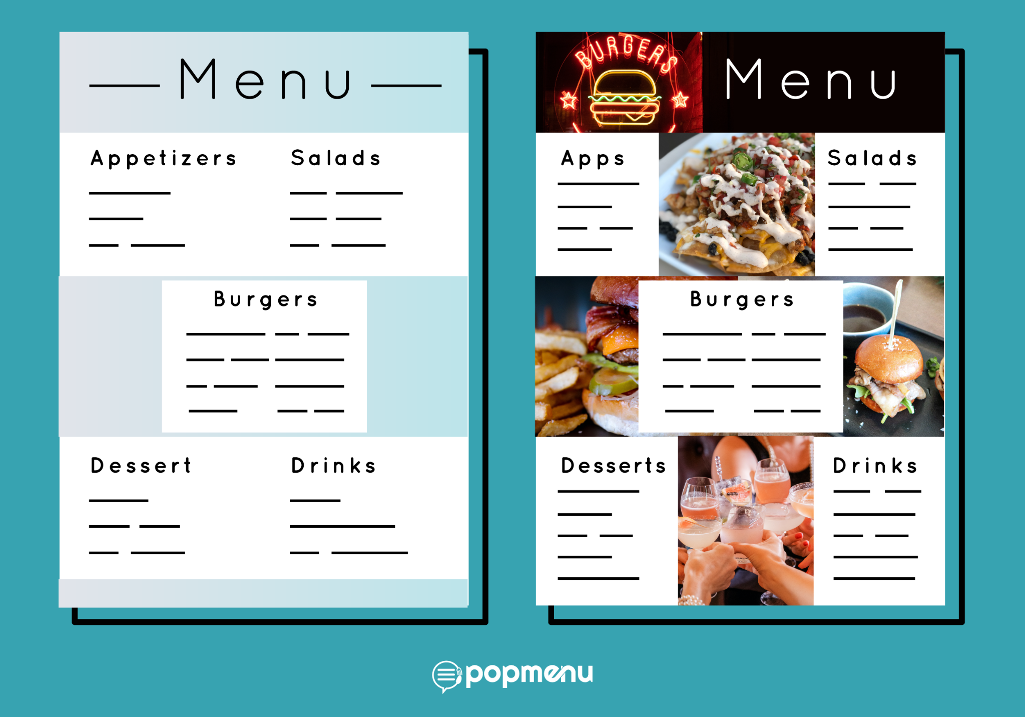
Whether to use photos of dishes in your printed menu is something restaurateurs have been struggling with for years, because there’s conflicting evidence about whether they’re effective.
When it comes to online menus, studies show that having photos of each dish can massively boost online orders for that dish. But on a physical menu for in-person dining, studies show that guests tend to associate photos with cheap, mass-produced food, and too many images can actually be a turn-off.
That’s why it’s important to be mindful about how you use photos and other imagery when designing your menu. In some cases, photos might be just what guests need to imagine themselves sitting down to a mouthwatering meal. But for other restaurants, photos might not fit the theme and the atmosphere.
Turn Your Menu Into a Sales Tool
Finally, to get the most out of your menu, you have to think of it as a “silent salesperson.” Use your menu to highlight high-profit items—for example, by listing them as chef’s specials or guest favorites. There are also a number of menu engineering tricks that can be used to maximize profit through menu design.
9 Restaurant Menu Ideas You Can Use at Your Restaurant
Ready to be inspired by some of the best restaurant menus? These 9 examples are full of menu design ideas you can take and implement in your own restaurant.
Fine Dining Restaurant Menu Ideas
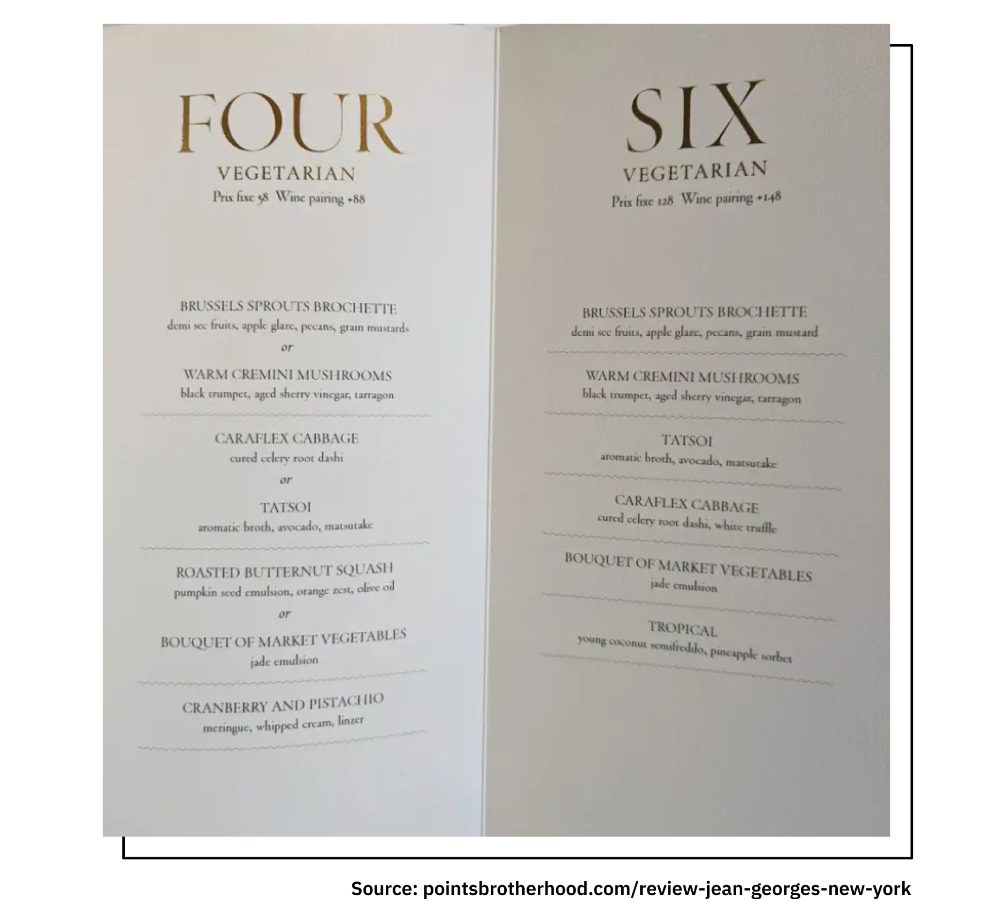
If there’s one restaurant that is synonymous with fine dining, it’s Jean-Georges, the two-Michelin-starred flagship restaurant of Chef Jean-Georges Vongerichten. And its menu is a perfect example of what a fine dining menu should be.
Since Jean-Georges offers tasting menus, it utilizes a simple menu design that can change as often as the dishes do. A two-panel design makes it easy for guests to see their options, which are listed simply in an elegant font. The gold detailing reflects the opulence of Jean-Georges’s white-linen dining room with sweeping views of Central Park.
Casual Bistro Menu Inspiration
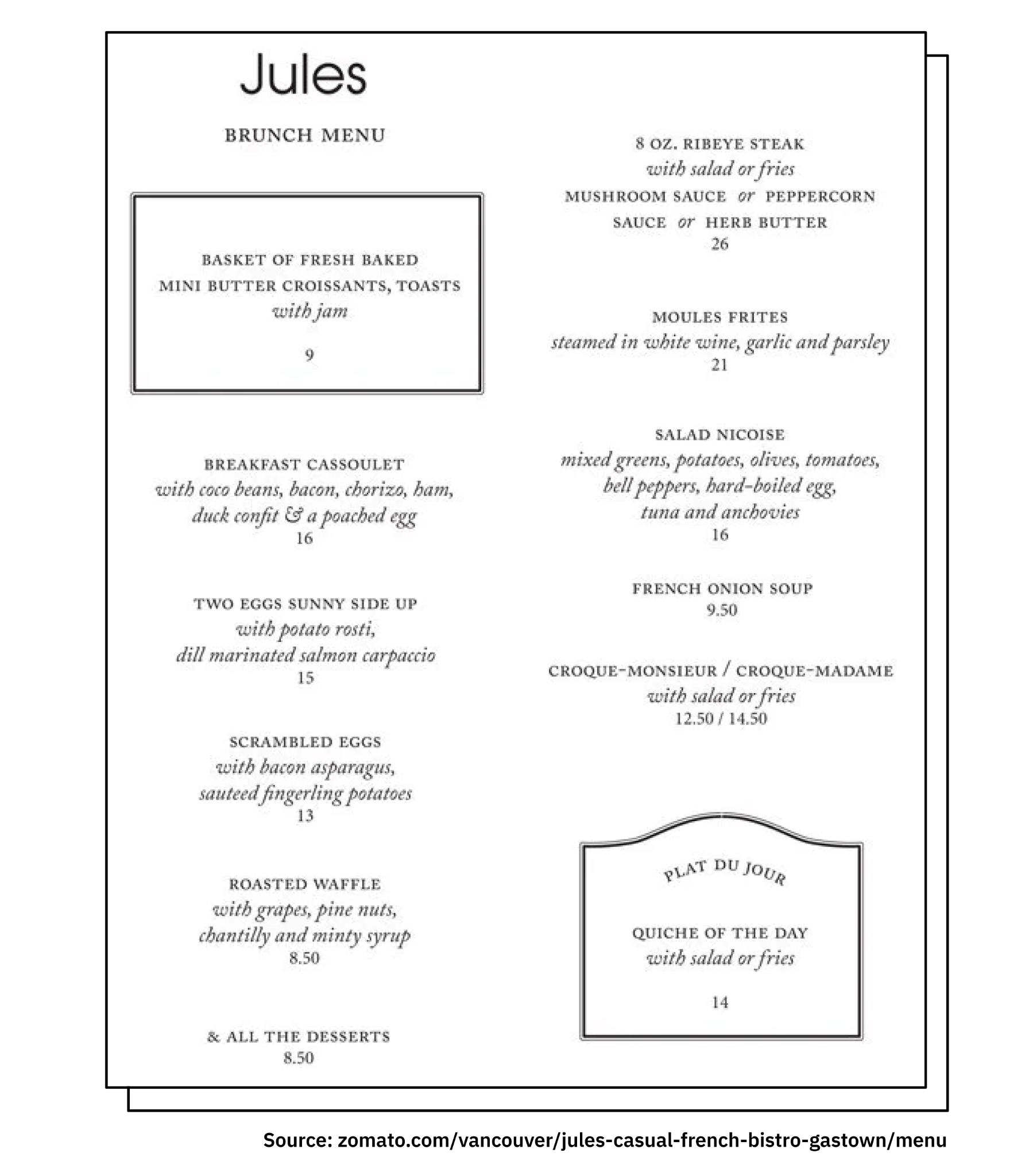
Vancouver’s Jules French Bistro also uses a simple and straightforward design with plenty of white space. Simple, yet elegant, shaped outlines draw the eye to the daily special and a bread basket, likely a high-profit item for Jules.
Modern Italian Fare Restaurant Menu Ideas
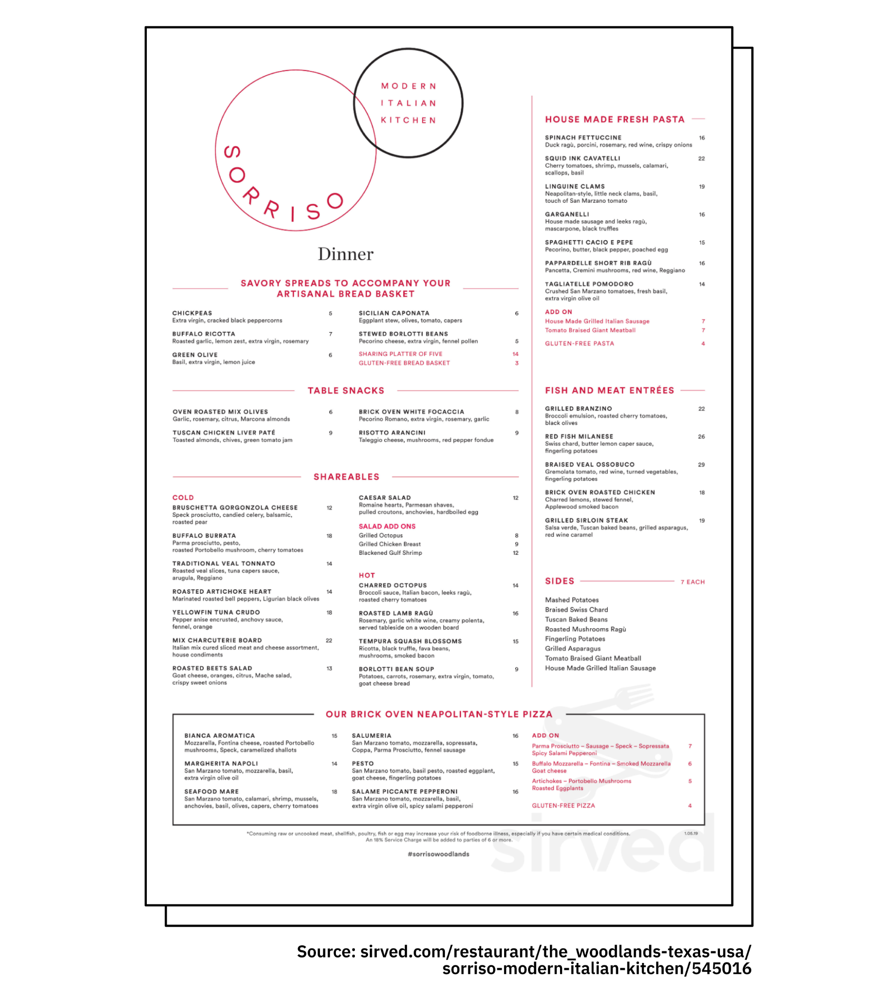
Sorriso, located in Woodlands, Texas, boasts “Modern Italian” fare, which is reflected in its very modern menu design. Using red text to draw guests’ eyes to add-ons can help boost check sizes. And instead of separating the menu into appetizers and entrees, Sorriso has separated out different types of plates and dishes, allowing it to place house-made pasta, likely high-profit dishes, where guests’ eyes will be drawn right to them.
Seafood Restaurant Menu Ideas
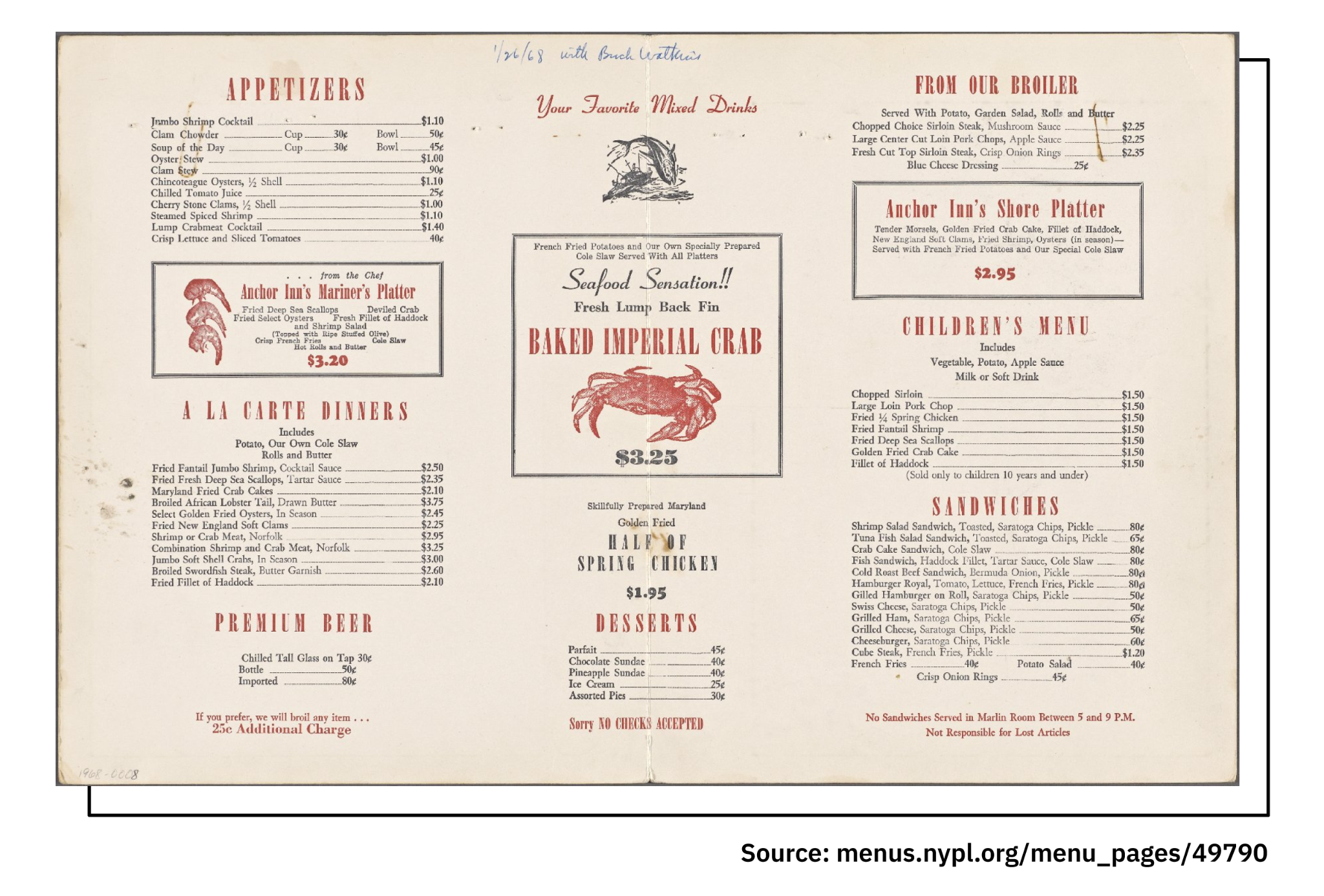
The menu for the Anchor Inn Seafood Restaurant nails the nautical vibe you’d expect from this type of eatery. Instead of dish photos, some of the restaurant’s specials are highlighted with illustrations, drawing guests’ eyes without making the overall menu look any less polished.
Coffee and Brunch Menu Inspiration
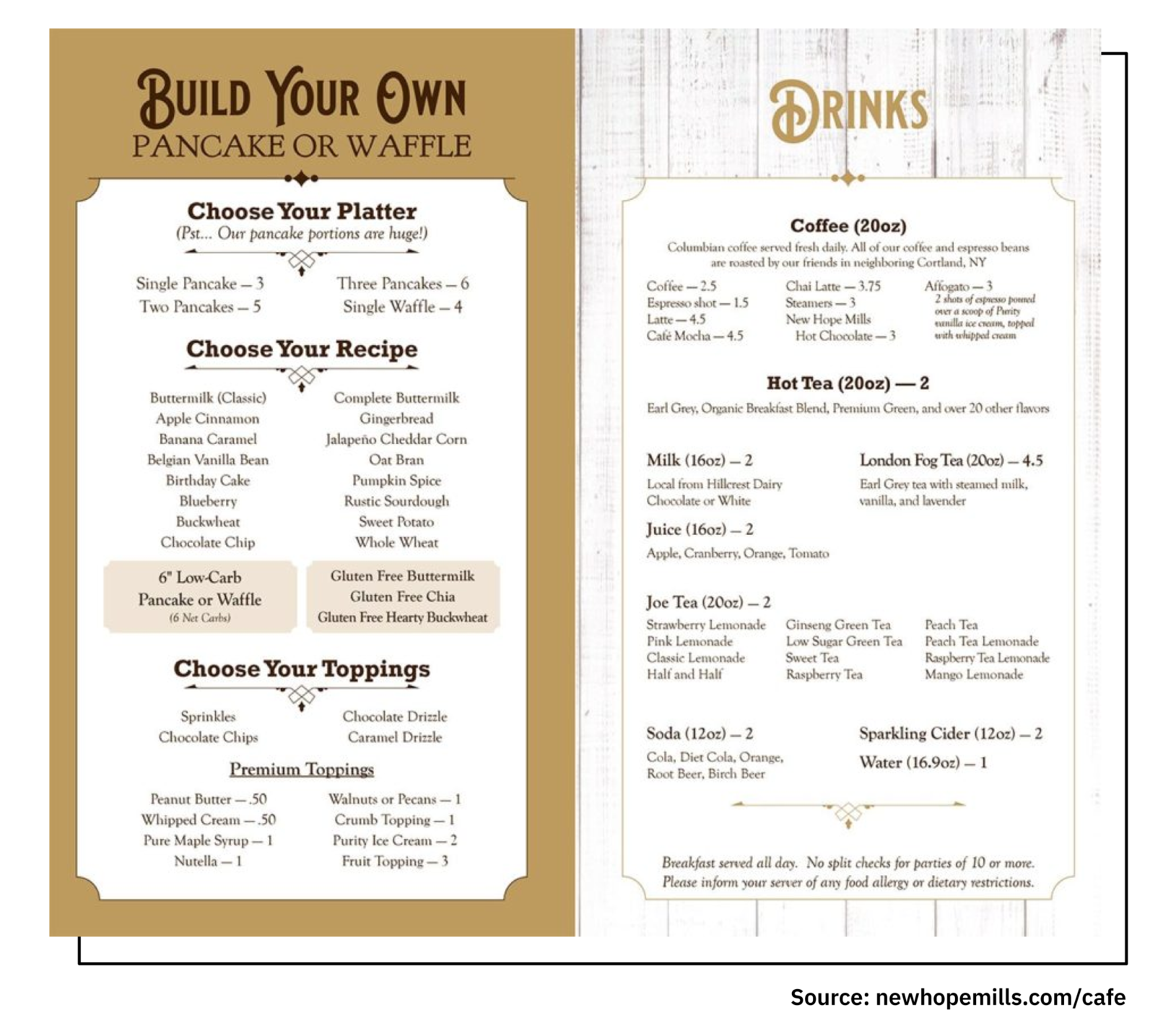
Auburn, New York’s New Hope Mills Cafe is famous for one thing: its pancakes. So its menu keeps things simple: A step-by-step, build-your-own pancake or waffle section, and on the opposite page, an extensive menu of drinks. Using the golden triangle, New Hope Mills has placed its tea selection, typically a very high-profit item for a restaurant, at the center of the page.
Menu Ideas for Casual BBQ Fare
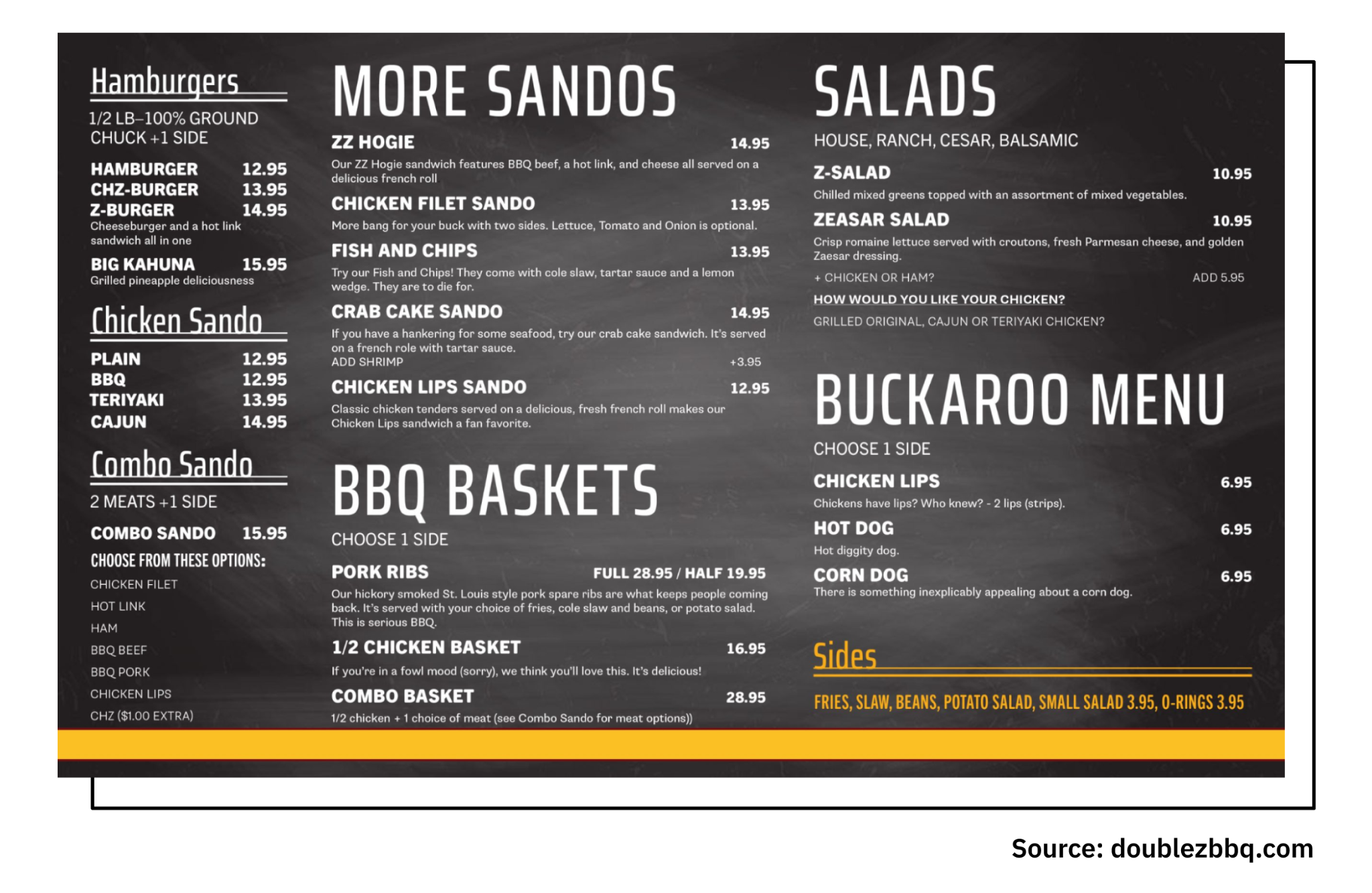
BBQ is one of those cuisines that has a strong image associated with it: Fire and smoke, metal, masculinity. The menu at Steamboat Springs, Colorado’s Double Z also evokes all those things, with a dark gray menu with yellow accent that draws the eye to add-on sides that will help boost check sizes.
Trendy Brewpub Menu Example

Oregon’s Rogue Brewing is another restaurant that has created a menu that perfectly matches its atmosphere and branding. The whole menu follows a “revolution” theme, right down to creative headers for each section. Not only are higher-priced entrees placed at the center of the page, but red text describing the sides that come with each dish further draws the eye.
Restaurant Menu Ideas from a Classic Diner
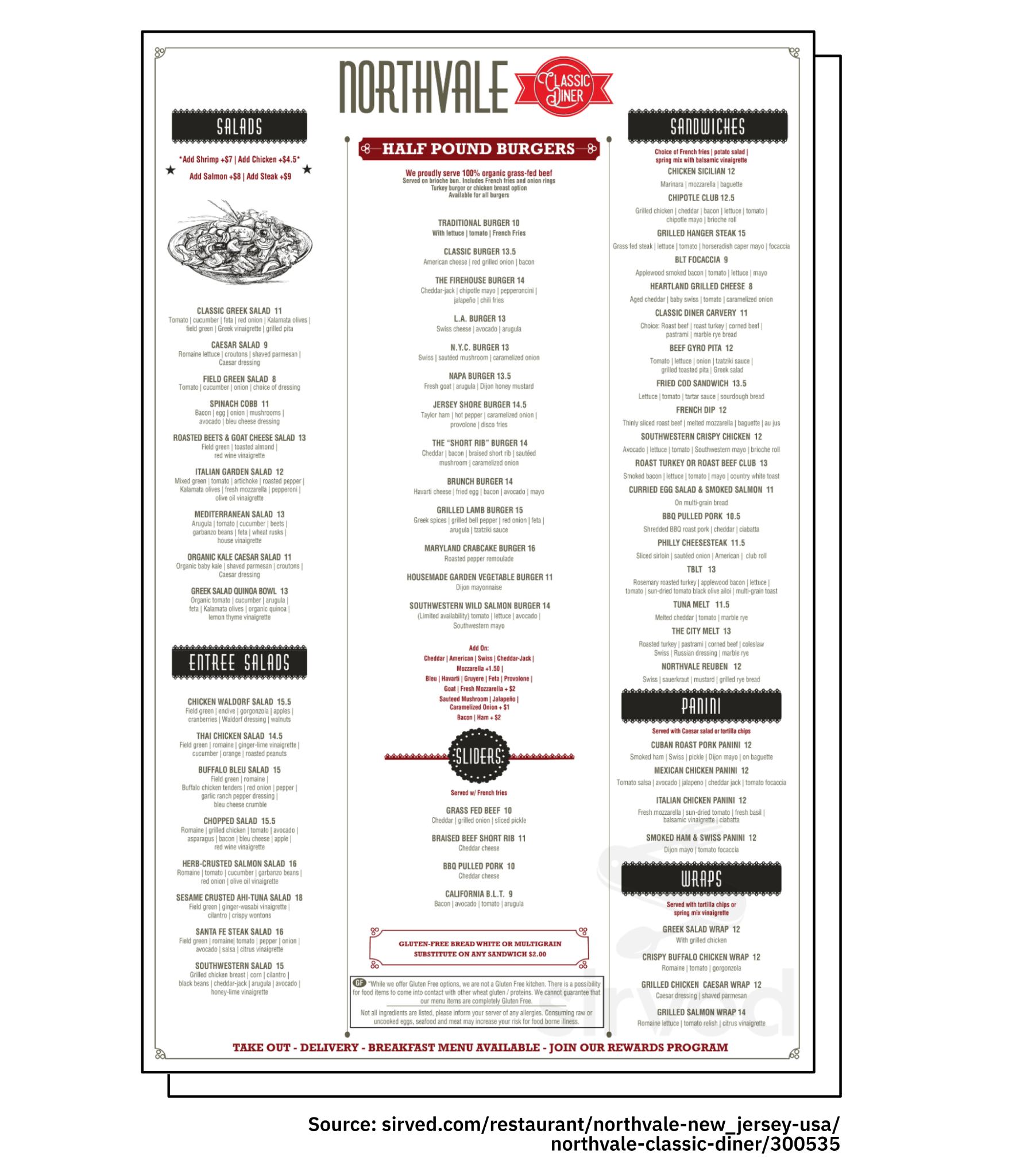
A classic diner comes with a lot of nostalgia, and this menu from Northvale Classic Diner perfectly blends modern design with the nostalgic feeling guests expect to get from eating at a diner. As should be the case at any diner, burgers take center stage with an eye-catching middle section, while the upper right is reserved for sandwiches, starting with high-profit options like the grilled cheese.
Turning Your Restaurant Menu Into an Online Experience

Taqueria Habanero, a trendy Mexican spot with multiple locations in the Washington D.C. area, has a great example of an online menu. It keeps the restaurant’s branding consistent, uses clear sections to separate different types of dishes from tacos to sopas (with a brief description of what guests can expect from dishes in each section), and uses high-quality images of every single menu item.
Taqueria Habanero clearly knows that more information is better with online menus, which is why guests can also select a dish to see comments and reviews from previous guests who have already ordered it. The restaurant also makes it easy to place a takeout or delivery order straight from the menu.

Taqueria Habanero has taken its online menu and turned it into an engaging, interactive experience for guests. What’s even better is that your restaurant can, too—with Popmenu.
Engaging, Interactive Online Menus Made Easy with Popmenu
Popmenu makes it easy to create eye-catching, mobile-optimized online menus that draw guests in. It also makes it simple to turn them into physical menus, via an easy-to-use Print Center with a variety of restaurant menu templates.
But Popmenu does more than just menus.
Popmenu is the only all-in-one digital toolkit made just for modern restaurants. It can help you design and manage your restaurant website, market to guests in your community, manage social media and newsletters, and so much more. Popmenu is how modern restaurants manage their entire digital presence, from first impression to final bite.
When looking for new restaurant menu ideas, it’s vital that modern restaurants consider both their in-person menus, and their online menus—and how the two need to be different to be most effective. Popmenu makes it easy, and makes your menu the star of your restaurant’s digital presence. Ready to see for yourself? Schedule a free demo today.


