Your restaurant menu is a central part of your guests’ experience—it is how you introduce yourself to new guests, and it's a warm invitation back to your regulars. Popmenu’s recent survey of 1,000 consumers found that dish photos and descriptions on the menu, reviews, and an easy-to-use website are top factors when deciding which restaurant to try.
It’s clear that having a menu that is easy to find, easy to read, and easy to interact with is critical for your restaurant, but as anyone who has ever looked up a restaurant online knows, there are good online menu designs and bad online menu designs. How do you ensure you’re one of the good ones? We’re glad you asked! Here are our best practices for creating a crave-worthy online menu that brings in more orders.
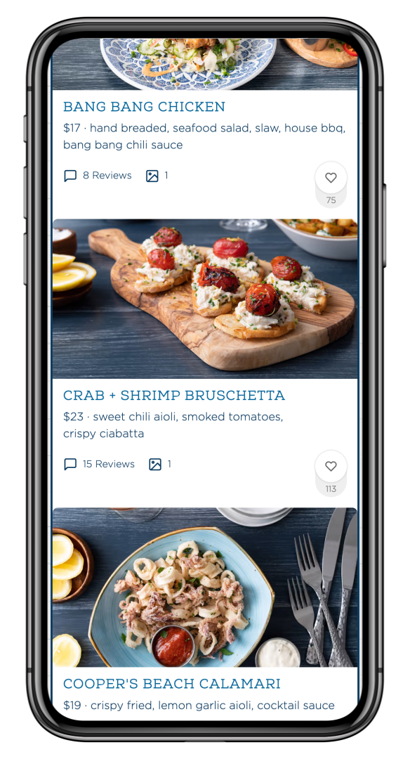
1. Ditch the PDF
This may sound obvious, but trying to make a classic paper menu work online…well, it just doesn’t. Consider this: 73% of diners typically place an online order with a mobile device—and PDFs are not friendly to a cellphone. Scrolling up and down, side to side, and pinching to zoom is an annoying experience all too common with the dreaded PDF menu. The static menus are hard to read and offer no interaction, photos, sharing ability, or even basic attraction to draw in your diners. In fact, 30% of guests say they will immediately move on if they see a PDF menu on a restaurant website. Simply avoiding the PDF in favor of an interactive menu on your website is the first step to creating a food menu design that pops!

2. Add photos to showcase your food
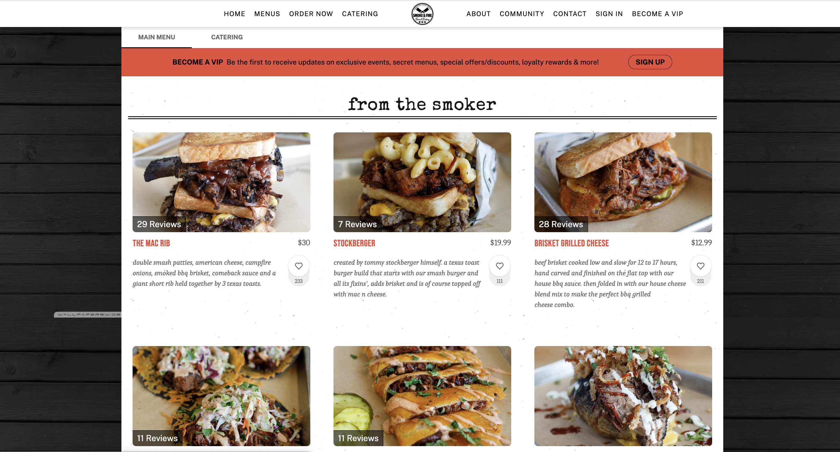
Your ambiance and service are an important part of your restaurant, but so is your online food menu design. After all, people eat with their eyes—so, make sure your delicious dishes get the exposure they deserve. Add photos to your online menu to entice guests to order online or pop by to dine in.
Bonus tip? Adding photos to your online food menu helps you stand out against other restaurants!

3. Make your menu social
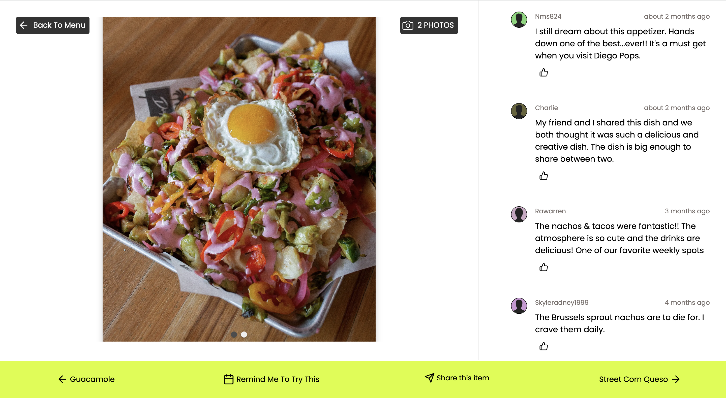
Now that you have a mobile-friendly menu with gorgeous dish photos, you can include a social component to your food menu design—bring the power of reviews to your menu. Guests value reviews when making decisions: 57% said that reviews on dishes are a top reason they’ll try a new restaurant. Why not bring that social proof right onto the menu vs letting a third-party website (like Yelp!) own commentary about your food?

4. Make your menu sharable
Can you share menu items in an email directly from your menu? Can you add an item or a cocktail menu to a Facebook post? Can you send a link to just your new holiday menu? If you answered no to any of these questions, it is time to design your menu to be connected. PDF menus and images are designed to be one singular piece of content. If your menu is made up of individual dishes that are indexed as separate pages, they can be shared via email, text message or social channels...and can significantly boost rankings in search engine results.
PDF food menu designs limit sharing ability; sure, guests may be able to text a link to the whole menu or attach it to an email, but a more interactive food menu design lets guests get more specific with what they're sharing—passing along a specific cocktail, a special dinner or limited item.
.jpeg)
5. Organize your menu for flow and interest
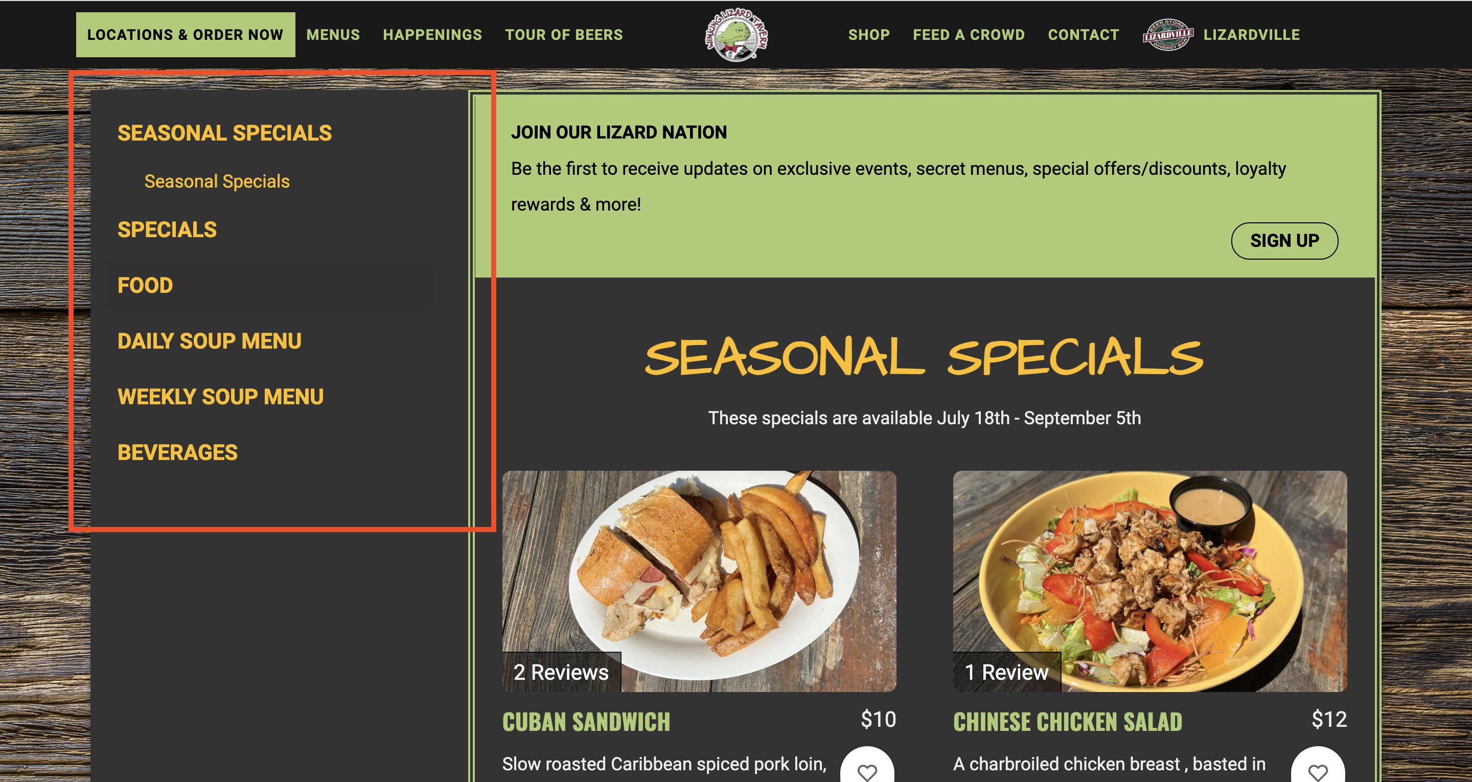
Instead of one long static menu, break up your online menu in a way that makes sense and encourages browsing. No diner wants to scroll through pages of drinks, salads, appetizers, entrees, and pasta if they’re looking specifically for that Tiramisu they have been craving.
With a modern, interactive food menu design, you can separate out your menu into sections: Cocktail List, Wine Menu, Dessert, and, of course, Entrees can each be emphasized online.
You can also list your menus by the time of day, such as Brunch, Lunch, and Dinner.
Or try listing daily specials in separate, clickable menus with links to that day’s offerings.

The options are endless, but creating easy-to-read, easy-to-find, and easy-to-share food menu designs can be the difference between someone just jumping in and out of your website or lingering on your site and deciding to dine or order online. With Popmenu’s dynamic menu technology, guests typically stay on the menu page twice as long as a page with a PDF or static text menu—making them 2x more likely to be enticed to order.
See how Popmenu client, Terra Terroir uses its online menu to engage with guests and streamline online operations.


.jpeg)


