Restaurant menu design has never been easy.
Restaurant owners and managers know that designing a functional, effective menu is more complicated than just putting a list of dishes and prices on a page. Yes, it needs to include dishes and prices—but also photos, well-written descriptions, and the right color scheme and font. It needs to fit your restaurant’s branding, mood, and vibe. It needs to fit your guests, too.
In other words, there’s a lot to take into consideration when designing a restaurant menu; and today, when restaurants need physical menus and an online version, the process is more complex than ever.
But we know that restaurant menu design matters. Having a well-designed menu can help you tell your restaurant’s story, connect more deeply with your guests, and, most importantly, boost your restaurant’s sales and revenue.
Not sure where to start? Then this guide is for you. Read on to learn why restaurant menu design matters, the most important elements of a good menu, and the one tool you need to manage both your physical menus and an interactive, online menu experience.
What Restaurant Menu Design Can Do
There are two main reasons why restaurant owners and managers should put so much time and effort into their restaurant menu design.
First, because your menu will impact how your guests feel. There are entire studies on the psychology of menus, including how different items, prices, photos, layouts, colors, fonts, and other elements can actually influence how much your guests order and spend. We’ll get into this more below when we talk about considerations and elements you should include in your menu design.
The second reason is because your menu can (and should) be a marketing tool for your restaurant. This means you should be using your menu to:
- Tell your restaurant’s story.
- Present dishes in mouthwatering ways that entice orders.
- Promote specials or items with higher margins.
- Promote offerings other than your food and drinks, like delivery service or events.
In other words, your menu is more than just a utility that shows guests what dishes they can order at your restaurant. It’s an often overlooked detail that fits into the bigger picture of what your restaurant provides. When designed well, your menu can be part of an overall experience that you create, from start to finish, for guests at your restaurant.
Considerations for Modern Restaurant Menu Design
When beginning your menu design process, there are four main considerations for creating a menu that will accomplish all your goals.
Consideration 1: Your Restaurant

First, consider your restaurant itself.
What kind of service do you offer—fast casual, family friendly, or fine dining? What’s your price point? What type of cuisine do you serve? What’s the environment like inside your restaurant?
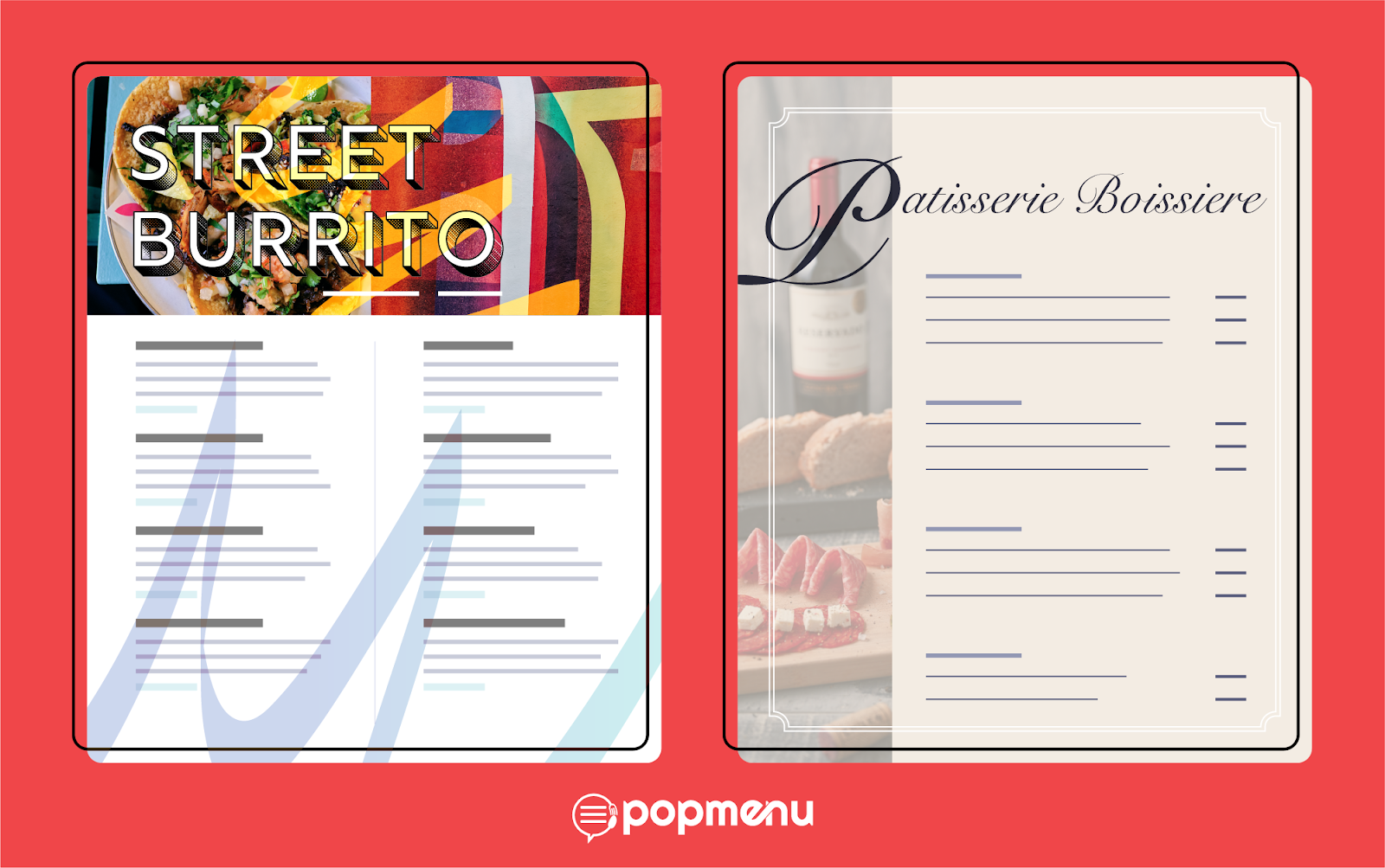
All those questions will help determine the kind of menu you need, and what it will eventually look like. A fast-casual burrito spot needs a very different type of menu than an upscale seafood restaurant, for example.
At the end of the day, it’s important for your menu to make sense within the type of restaurant you have. It should also display your restaurant’s branding; say, by using the same color scheme as your logo and decor. This is the part of the design process where you want to think of how your menu fits into the overall experience guests have at your restaurant.
Consideration 2: Your Guests
Similarly, it’s important to consider your guests when designing your menu. This goes hand-in-hand with considerations about your restaurant; for example, if you offer family-friendly dining, you might want a separate kids menu, or if you cater to a light-night crowd, specialty cocktails and small plates might be the best offerings to list on the most prominent part of your menu.
When thinking about your guests, consider their journey through your restaurant. When they sit down, do they tend to order a round of drinks and appetizers before they move on to entrees? Is your eatery a spot where people grab a quick bite at lunch, or a restaurant where parties tend to hang out for a while? These are all things that can inform your menu design.
Consideration 3: Content Before Design
While your menu should be attractive and beautifully designed, the content is more important.
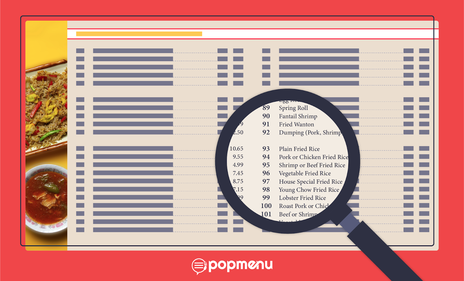
Make sure your menu is clear and easy to read, and that it puts your best dishes front and center for guests to see.
If your dishes need explanations, be sure to include them, and make sure they’re also clear and well-written. It’s also important to include any information guests need to know about your service style or cuisine—for example, if you serve dishes family style, make it clear in the menu so guests know exactly what they’re ordering.
Consideration 4: Menu Design Elements You Need to Know
And finally, there are the design elements themselves. Let’s take a look at eight design elements that can go into a great menu.
Limited Options

In menu design, less is more. Guests can be overwhelmed when faced with too many choices, and studies show that when people struggle to decide what to order at a restaurant, they typically end up ordering less. Experts say each section on your menu should be limited to seven total items, wherever possible.
Use White Space
It goes hand-in-hand with limiting your menu items. But a great way to make your menu more visually appealing (and easier to read) is to embrace white space—not try to fill it up. It’s OK for your menu to have spaces on the margins and between sections that don’t have any text or photos.
Use Psychological Tricks with Pricing
In the restaurant industry, there’s a famous study from Cornell University that showed a few simple pricing tricks can help restaurants give a big boost to their bottom lines. The study showed a lot, but two common and simple tricks will help you increase average check sizes:
- Don’t use dollar signs ($) on your menu. The Cornell report showed that guests tend to spend more when they just see a number representing the price of an item, without a dollar sign.
- Use expensive decoys. For example, say you offer a bison burger that’s expensive, but offers your restaurant a high profit margin. If it’s the most expensive thing on your menu, guests will shy away from ordering it. But if you add a more expensive item, you’ll likely see more orders for the bison burger.
Highlight Items with High Margins
Your highest-margin items are your key to higher profits, so use your menu to highlight them. Put them in a separate section for “House Specialities,” or use an icon next to them to indicate that they’re a guest favorite.
Use Photos (the Right Way)

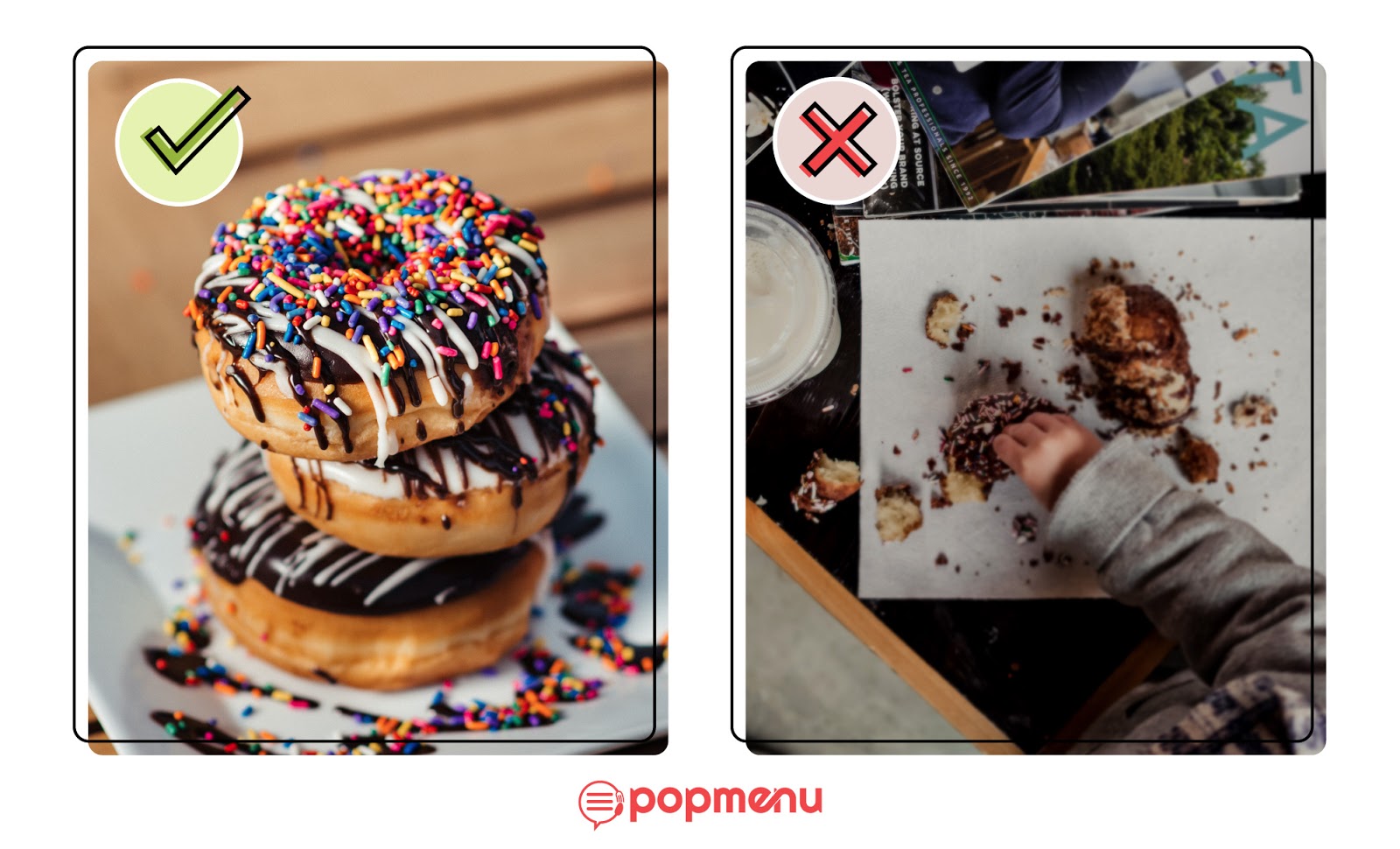
Having a photo next to a dish name on your menu can increase sales of that item by as much as 90 percent, according to recent studies. But including photos on your menu can backfire if it’s not done properly.
First, make sure to invest in high-quality food photography that captures your dishes looking their best. A professional will know how to stage the food and adjust the environment, lighting, and other factors to make your food look as delicious as possible. Then, make sure to use high-res images in your menu, and that it’s clear which dish appears in each photo.
Use the Golden Triangle

The “golden triangle” is another psychology concept. When people look at a page, like a restaurant menu, they tend to look first at the center, then move their eyes to the top right corner, and then the top left corner, following a triangle shape.
Restaurant owners and managers can use this trick, and place their most profitable menu items along the “golden triangle” to increase their visibility with guests.
Translating Restaurant Menu Design from Physical to Online
Once you’ve designed a physical menu, putting it online is as easy as adding a PDF to your website, right?
Unfortunately, no. PDFs are not the best way to display your restaurant menu on your website, for two main reasons.
First, PDFs are often not mobile optimized, which means that if a potential guest tries to view your menu on a mobile device with a small screen, they may have to pinch and zoom to see different sections, or your menu may even be unreadable.
The other reason is that Google can’t read the text on a PDF menu, which means your restaurant won’t show up in search results if potential guests are looking for certain dishes—even if those dishes are your speciality. Your menu, along with the rest of your website, needs to be search engine optimized, so Google can index all of your content and make it findable when guests search for terms related to your restaurant.
Popmenu: The Only Tools Restaurants Need for Modern Menu Design
So what should restaurants use instead of a PDF menu? Many just add a text menu, but there’s an even better option: Popmenu.
Our interactive, one-of-a-kind menu technology is proven to work better than a PDF. The average guest spends just 15 seconds on a restaurant’s online menu before navigating elsewhere. But the average guest spends 1 minute and 50 seconds on a Popmenu menu—that’s a menu that holds a guest’s attention over 7x longer.

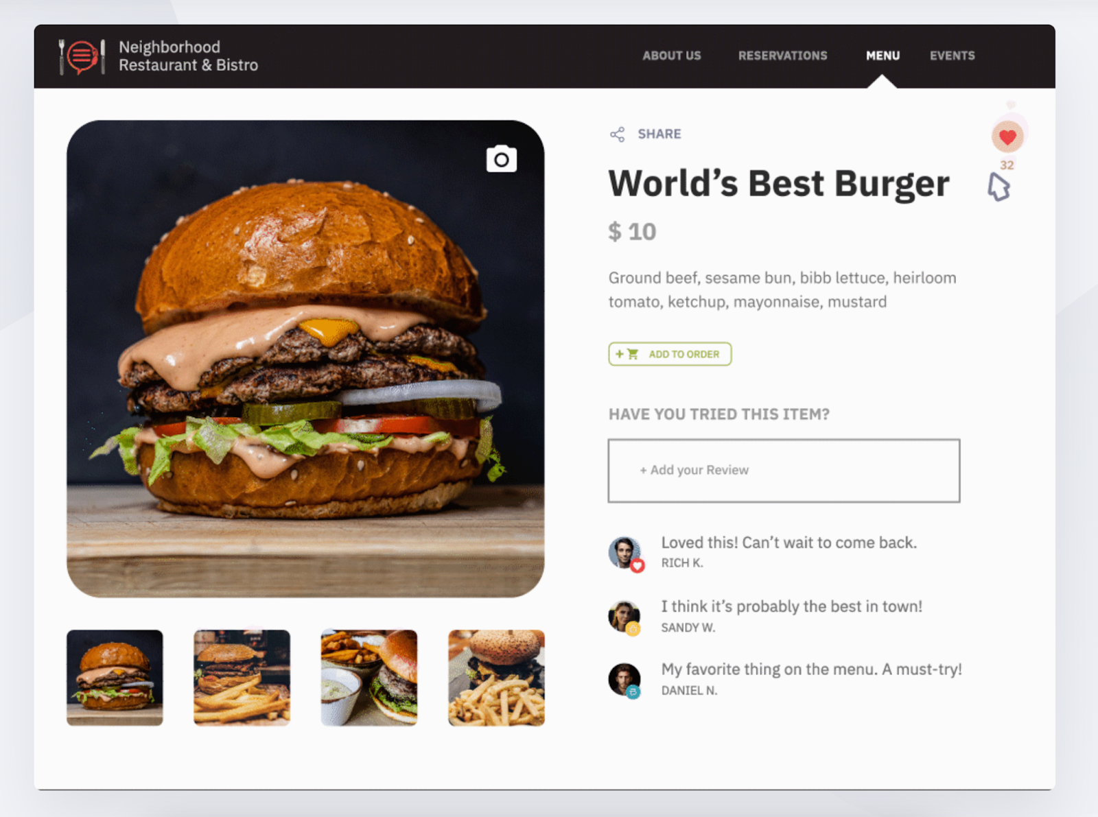
Popmenu menus are fully search engine optimized. They’re also interactive—guests can leave “Pops” on dishes they love, and write or read reviews of individual menu items right there in the menu. Using Popmenu turns your restaurant’s online menu into an experience for guests—and one that keeps them engaged and makes your restaurant stand out from the crowd.
And once you’ve created your online menu, it’s easy to turn it into a physical menu that looks just as great. Our Print Center in my.pop allows you to add existing menus and dishes from your website; drag and drop elements where you want them; add your logo, photos, and other assets; adjust fonts and text sizes; choose the size of your menu; and more, all with just a few clicks.
And that’s not even all that Popmenu offers. Our platform is an all-in-one digital toolkit for modern restaurants, which can help you manage your website, social media, marketing channels, and more. Popmenu is how modern restaurants take back control of their entire digital presence, from first visit to final bite.
Ready to see how Popmenu can help you level up your website, menu, and more? Schedule a free demo today.


